[Mod Request] E3 Hud

+
GregorWladacz;n9707271 said:
VedmakOfOld I mean, it's just meaningless.

The purpose of the comment was to just maybe get them to reconsider the reconsideration since a few people already commented about the same thing.

it is no ones (probably) intention to see less of this mod.
 
we do not post updates here to ask for opinions, we post updates to show progress

as for the change, we felt like the "old" pictures didn't meet the quality we sought out to achieve (all of the "colored" ones would have had to be remade anyway)

many things have been changed from the #E3 look because those things simply weren't finished in the demo either... or because they would be ridiculous amount of work for almost no benefit (the trail on the loading screen from where you are to where you are going)


as a side note.. the funny thing is, the loading screens are completely artificial anyway... you teleport within the same region in an instant, the loading screen is just a fake loading timer that i made (because otherwise there would be no point in them)... you can even cancel it with Esc or back button on the controller...
 
Last edited by a moderator:
(Marsh-bang through the door. BAM! Sticky goo everywhere. Several members in the thread stumble about. Sigi jumps in through a window. Sprays a burst of fire about the space. TAT-TAT-TATTA-TAT-TAT! Small marshmallows ricochet off of every surface.)

A couple of posts deleted and one post edited. Let's be friends! (Displays the assault carbine. Bullpup design. Laser sights. Full-sugar-jacket 5.56 mini-marshmallow ammo; caseless; 60-round clip.) This is my new moderatin' rifle! Put the old marshmallow sticks away. Gotta get ready for Cyberpunk! Make some new friends!

(Considers the busted window for a sec...leaves quietly by the door.)
 
Hi, probably you will kill me for it, guys but I have some questions and comments... :)

1) Do you plan to swap all miniatures of monsters (mean those from strongest monster hud) with these which are already in bestiary? Thanks to it all miniatures will be equal in design.

2) I would like to mention about that preparations menu - I have a theory that it is directly connected with strongest monster hud and the menu + the description of monster on the right depends on which monster is currently the strongest(It might also depend on the quest). I don't say that you have to bring it back (it is a bit useless I admit) but maybe with this idea you will rethink it again?

Or think about a system in which if you take a potion from preparation menu - so you "meditate" before fight you are prized with longer duration of potion(like in W2 for few minutes), small decoction bonus and oils last a bit longer. And when you simply drink potion in combat the duration is normal - short.

I know you are making HUD mod not alchemy mod but only you are able to add preparation menu. I think this idea would be a nice addition because if you don't like spending time on preparing you don't have to use it/ if you want to prepare like real witcher you will be granted with bonus. So casual players and advanced players will be content.

3) Have a question about icons of potions in in-game hud - do you think about 4 icons for potions like it is already. I must say for many people it was a really good change to have ability to use 4 potions in fight. Here is my suggestion how it would be done: https://imgur.com/fWZePcB

4) Last question about inventory menu - did you notice how the frame works in demo 27:22 https://www.youtube.com/watch?v=N4ony2r0QFs

All I wrote here are only suggestions not requests so chill out ;)

PS About loading screens - you will do it as you want but remember: one of the most important thing of your HUD should be cohesion of design. And I completely agree dark screens looks good but do they fit to the rest of HUD which is colourful and detailed? I am not sure - remember Fernando did dark screens for post-E3 HUD which supposed to be dark and minimalistic. I am sure you will make best decision as you can, just remember my words. :)
 
1) done already

2) they are connected but preparations menu is beyond broken, editing swfs isnt easy in the first place and preparations menu was far from being finished by cdpr.. (and like u said, its kinda useless anyway) not worth the effort..

3) u can still use 4 potions, holding down the dpad up/down or R/F (or whatever the buttons for drinking are on kb/m) will swap the potions with the other one

4) yeah, we didnt really want it to move like that...


update on the character panel.
As always its WIP (im aware of not everything being alligned perfectly). Also note that everything is a teameffort.
 
JUANMAS7ER;n9719791 said:
Nice to see that the mutations introduce in Blood and Wine are implemented now on the mod, congrats!

about that, havent tested it cause i havent played Blood and Wine to that point yet. So if you or anyone got a save where the mutation thing is unlocked would be nice. Looking online for safe files is very dangerous in terms of spoilers :/
 
KamehamehaNudel;n9721551 said:
about that, havent tested it cause i havent played Blood and Wine to that point yet. So if you or anyone got a save where the mutation thing is unlocked would be nice. Looking online for safe files is very dangerous in terms of spoilers :/

you can actually just enable them via the console: enablemutations(1)
 
KamehamehaNudel
If you want i can pm you with a BaW savegame (main story & both DLCs finished). I can save it in some place i would consider "spoiler safe" if you want. Just gotta avoid traveling to some places and reading the quest journal/character entries tho.
 
KamehamehaNudel;n9719551 said:


update on the character panel.
As always its WIP (im aware of not everything being alligned perfectly). Also note that everything is a teameffort.

I would get rid of Geralt's picture in the background. It is just needless clutter.
Or at least make it more transparent so it wouldn't stand out this much.

Besides that it looks great!
 
introv3rt;n9722661 said:
I would get rid of Geralt's picture in the background. It is just needless clutter.
Or at least make it more transparent so it wouldn't stand out this much.

Besides that it looks great!

+1
 
introv3rt;n9722661 said:
I would get rid of Geralt's picture in the background. It is just needless clutter.
Or at least make it more transparent so it wouldn't stand out this much.

Besides that it looks great!

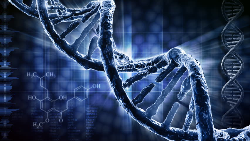
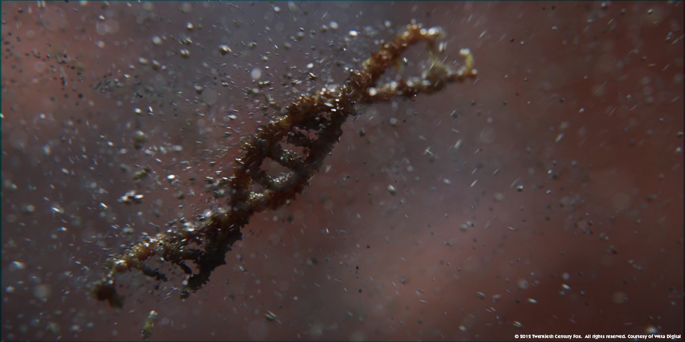
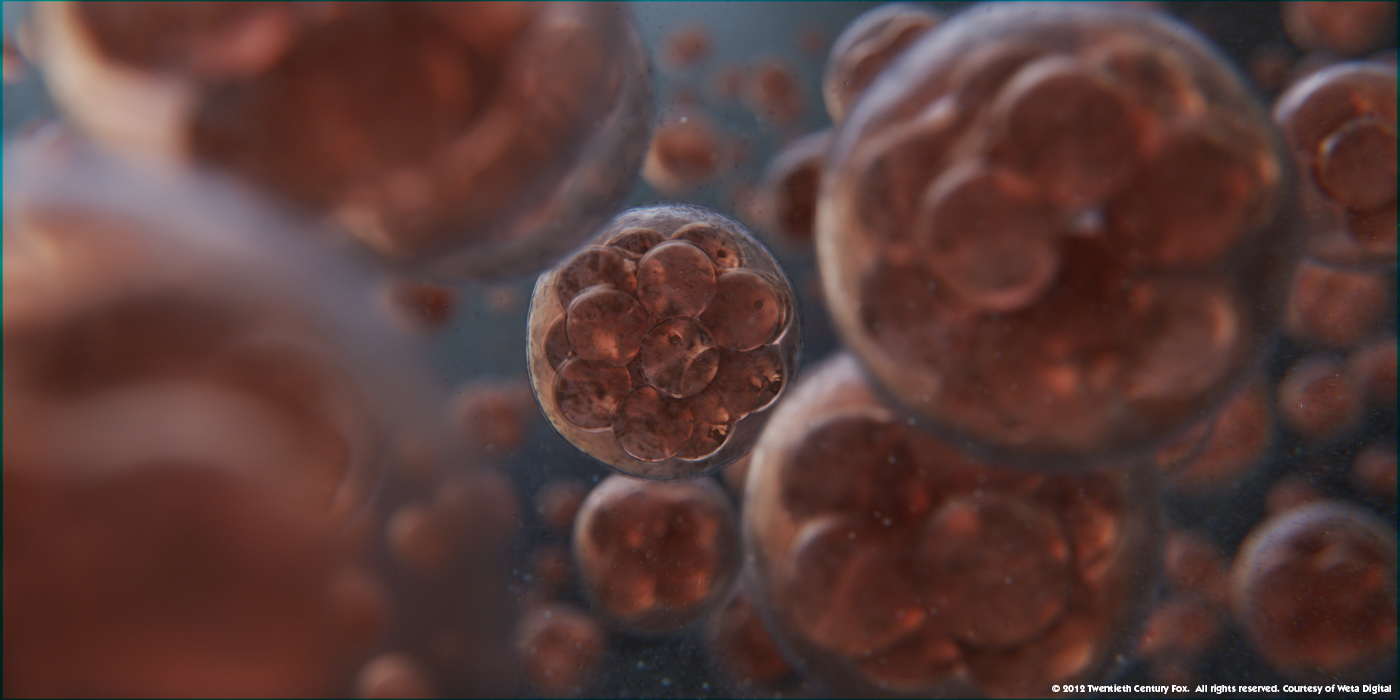
Making it more transparent or removing it altogether sounds like a good idea. IMHO it would make much more sense if there was a cool-looking pic of DNA strand on the Signs tab instead of Geralt.

Something like that but obviously more in line with the UI color scheme.


DNA strand from Prometheus


Molecules from Prometheus


Last edited:
Top Bottom