


Hello,
I'm rather new to the forums, but there's something concerning the speed of the game that's been bugging me, even back in the beta. I saw that there's been discussions here about the "Forfeit-mentaility", even suggestions about how to reduce the number of forfeits - what I am concerned with is the result of a forfeit, and how to improve that.
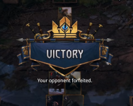
If you simply win (or lose) the game, you get a nice victory animation for a few seconds and then you are good to go to the end screen points, GG, and next match. However, if the opponent forfeits, while you still get the animations, a totally unnecessary and blunt textbox then jumps in the middle, saying "Your opponent forfeited" with just a single OK button that you must click to move forward to the end screen.
It's not that annoying, and I understand that the player should be informed that they won because the opponent forfeited, but is that textbox truly necessary? Wouldn't it be a lot more dynamic and speedy if this information was just a label that accompanies the end animation? See the attached image. Text of course in nicer font, better alignment, etc...
The point is to eliminate the rather crude textbox that pops up in the middle of the nice victory banner, and avoiding an absolutetly unnecessary click button. It's not much, but would definitely improve the end-game flow in my opinion.
I'm rather new to the forums, but there's something concerning the speed of the game that's been bugging me, even back in the beta. I saw that there's been discussions here about the "Forfeit-mentaility", even suggestions about how to reduce the number of forfeits - what I am concerned with is the result of a forfeit, and how to improve that.
If you simply win (or lose) the game, you get a nice victory animation for a few seconds and then you are good to go to the end screen points, GG, and next match. However, if the opponent forfeits, while you still get the animations, a totally unnecessary and blunt textbox then jumps in the middle, saying "Your opponent forfeited" with just a single OK button that you must click to move forward to the end screen.
It's not that annoying, and I understand that the player should be informed that they won because the opponent forfeited, but is that textbox truly necessary? Wouldn't it be a lot more dynamic and speedy if this information was just a label that accompanies the end animation? See the attached image. Text of course in nicer font, better alignment, etc...
The point is to eliminate the rather crude textbox that pops up in the middle of the nice victory banner, and avoiding an absolutetly unnecessary click button. It's not much, but would definitely improve the end-game flow in my opinion.
Attachments
-
 Screenshot at 2019-05-12 20-10-56.png523.5 KB · Views: 42
