The Witcher 3 - Visuals

+
Status
Not open for further replies.
I think there is maybe misunderstanding based on what is really meant with "dark and gritty setting". I think @Tokei-ihto just talked about the looks, the graphical tone (brownish/grey and quite limited color palette, dark sceneries, grain filters) while CDPR talked about the narrative setting. A lot of western RPGs tried to have a dark and gritty look while they were quite little dark and gritty in terms of actual (narrative) content, e.g. Skyrim or even Dragon Age. The extend of "dark" and morally grey content is a lot higher in the Witcher games (and even more so in the books).

You are right. I jump the gun too soon. I had to take a tinkle so I was a bit "pressed"! So my apologizes to @Tokei-ihto
 
This topic came up in the downgrade thread more and more and I think it's better separating the two discussions. For those of you who weren't following, it's the debate about whether or not TW3 should be a dark, melancholy and grey world, or a more colorful and "fantasy"ish place - Wild Hunt in particular and the franchise in general. Bear with me, I'm paraphrasing here.

What do you guys think?

Let this dumb stranger express herself with a simple sentence avoiding explanation bad writen and worse understanding.

No grit nor disneyland, just grey, no whit no black, just beautiful and awesome scenes filled with Sapkowski's colored portrayal in each page of his novels. Let the grit for the personality of the characters.. The hardness of a butcher slaughtering a chicken in the market square, amid the cries of children and the music of minstrels; the smile of a mother to see her son alive after the destruction of his people by enemy fire, amid the soot and ash. The intricate details of a difficult life that Geralt's testimony.

Dammit! I've writen too much once more :(. Sorry.
 
No grit nor disneyland, just grey, no whit no black, just beautiful and awesome scenes filled with Sapkowski's colored portrayal in each page of his novels. Let the grit for the personality of the characters.. The hardness of a butcher slaughtering a chicken in the market square, amid the cries of children and the music of minstrels; the smile of a mother to see her son alive after the destruction of his people by enemy fire, amid the soot and ash. The intricate details of a difficult life that Geralt's testimony.
Well said. I never thought I would ever read such insightful words coming from a cat.
 
Last edited:
Well said. I never thought I would ever read such insightful words coming from a cat.

You think?

Quoting the late, and very much lamented Terry Pratchett:
If cats looked like frogs we'd realize what nasty, cruel little bastards they are. Style. That's what people remember.

Having ugly incidents in beautiful places can be very effective, if they do it right (and don't overdo it).

(Oh, and thanks for giving me a hook to that one :) )
 
witchers tone.

I have been thinking about this for a while. and agree with people here, that there is a misunderstanding. the main thing I want to say though is that in regards to the witcher, tone made through color palate should just not be a concern. whether it is grey or colorful is just beside the point, as soon as you asked that question you missed it.

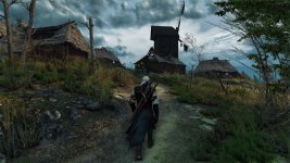
In the books the tone of the story varied, it was dark but also joyful at times, from the witchers lonely keep to the crowded streets of lively cities there is a variety of places that differ greatly. though thinking any of those places under any one light is wrong. the world of Andrzej Sapkowski is one where the moral ambiguity of the real world exists, one where there can be no Sauron, no intuitive evil threat, not even monsters. the world in his books is made with the same kind of philosophy as its morality, it is very much made to be a real place, within reason of itself though. Places are not made darker or lighter, the places are places, like actual places they are the way they are within reason, not for style, artistic allegory or because when that's how you felt you wanted them to be. places in the books are consistent with the world, and their appearance comes about by similar patterns that create places that actually exist. Kaer Morhen is not a lonely place, through when it makes its introduction it appears that way, It is in fact the place where Ciri grows up. there is humor and joy, just as there was looming threat there. during winter the keep is cold and dreary, when summer begins its a different story. the place has a deep history, it was not made simply to be the home of witchers and allot of consideration is made to make these locations in such a manner that it has created it's self.

the witcher 1 I felt understood this. it was more varied in tone than the second, and had a more realistic depiction or places and lighting, at the time being immersive, and grounding you in its world. the second game by comparison was quite colorful almost wherever you went. witcher 2 is pretty much hands down to me, the most visual stunning game you could play last gen, but it wasn't as concerned with what the first game did with visuals. places very much had the same quality and consideration in their creation, but used visuals differently. the witcher 2's visuals where a strength, but the job of grounding players in its world was communicated by dialogue more than other elements or mechanic. The witcher games have hands down, the best wright of anything in the industry today and i stand by that statement. despite this, other game play elements are not as well made, though I did enjoy them. combat was decent despite its quick time events that although entertaining where a step back, and less tactical depth than the witcher 1, alchemy was still ok but not as good as the first, dice was EXCELLENT the best, arm wrestling min games I could only ever do for the money had not so great mechanics and fist fighting was just QTE's, there was nothing to do but press buttons when the prompts came up, and I never found there to be any challenge in that. All side quests I found enjoyable, CDPR realy know how to craft them :) which is the other thing that really draws you in.

the witcher 2 was great, but did allot of things that the 3rd needed to improve. Visuals needed to have the same kind of consideration as dialogue, as well all the other elements. Visuals need to be part of story telling part of the game, not the icing for a graphics porno (excuse the language, I like good graphics as much as anyone) or the feature for the series, (witcher 2 gave the series a reputation for being colorful).

the witcher 3 with the announcement that it was to be open world imitatively aimed to bring its elements together. combat is going to be fluid and tactical as well as real time, the world will be filled with immense detail and density on a scale no open world game has achieved exploding the boundaries of the previous games, elements should draw the player in they should captivate and create a complete game though again are worrying because they don't appear as concerned with what the first game did, though I am yet to be proven wrong.

a screen, I am sorry to say I cant find thoug people may know it, of a document shows how the color of certain places is linked with its characteristics. this at first sounds good, but it is again away from what witcher 1 did. it uses its color or style as allegory, color is symbolic, rather than representative of the place as it is. its not being consistent with the game world, its communicating out side of it. Though I am not too worried about this, and look forward to a game that I will BLOW MY MIND. but this at least is my two cent's on the question, my opinion.

took 5 seconds, I take everything I just said back:
 

Attachments

  • The_Witcher_3_Wild_Hunt_War_ravaged_these_lands,_nobody_lives_here_anymore.jpg
    The_Witcher_3_Wild_Hunt_War_ravaged_these_lands,_nobody_lives_here_anymore.jpg
    435.4 KB · Views: 44
Last edited:
I think the big part of is the engine too. The fact that they used Dragon Age engine for TW1 had the effect how it looked. Now they use pretty much modified TW2 engine and let me tell you what. The game looks way less oversaturated than TW2.
 
As someone who works as a freelance painting artist and also draws cartoons/comics fairly regularly, I can assure you this game is not cartoony in its colour scheme at all. This isn't preference, this is colour theory. Daylight, bright white light, gives back the purest form of the colour of the material in question. Some of the other shots are during the early morning or evening when there is significantly more red hues and orange hues present -- which are also directly from the sun. Notice the shots in which the subject matter is in the shadow of a mountain or otherwise direct sunlight is obscured-- everything is slightly blue, a reflection of the next brightest source-- the blue sky. On top of this, direct sunlight or otherwise clear daytime tends to give great shadow effects, meaning any lit subject you see will have a contrasting shadow which could probably accentuate this "cartoony" effect.This is realism.

There haven't been any shots released that have been overcast or stormy and no scheme lit with only by moon light. These schemes are notably more diffuse, meaning the light is scattered in many directions instead of heading straight for the eye. This gives a washed out effect and tends to be more moody. The previous screenshots were all rather washed out and stylistically chosen to have more diffuse lighting (something like early morning light that I see, or a heavy blue filter or some description in the Skellige shots.

The answer that you're after is that the promotional material that you have seen as had fair weather and you're experiencing sunlight for the first time because you're all basement dwelling nerds were expecting the weather that the United Kingdom is apparently so famous for.

So if I hear the word cartoony one more time this is my two cents from my studies of light. Personally, I do like the diffuse lighting, but I also think it has it's place. I think I'll enjoy the awful weather when it happens and I'll enjoy the diversity of activities that come from the system.
 
It really just comes down to the fact that nearly all the promotional material these past few months, with the exception of the glorious 4K screenshot, has been under more or less the exact same weather conditions.

35 Minute - Clear skies
January - Clear skies
GDC - Clear skies, sunset (very yellow/warm light from the sun)
PAX - Clear skies, sunset once again

I'm not at all worried that the game will look too cozy all the time, in fact I think the colourful gameplay we've seen so far is gorgeous. However I would like to see some more variation, so my suggestion for CDPR would be to set the next gameplay video to some rainy/snowing weather, preferably a fullblown storm or fighting foglets in the mist.
 
There is a place for brightness even in a game like Wild Hunt that is of a darker theme. Part of it is cathartic, the lighter, funny or beautiful moments help you understand that the rest of the game is more intense. Part of it is that nature can be really beautiful and if we're going to have a game with day/night, weather, etc sometimes the game will have glorious sunsets or star-filled nights to go along with dark caverns or bloody battles. And part is sometimes, it is historically accurate to be bright. I'll give you an example.

There are times in the game where Geralt visits a peasant town and if he goes into the tavern or people's homes some of the interior walls have brightly painted flowers or patterns on them. When I was playing I thought this was curious so I asked and was told that in Eastern Europe it was relatively common for poor people to decorate their homes this way. Most couldn't afford paintings and there were no magazines or pictures, so this was how they brought some color & brightness into their world that could often be dull & dark.

It is important that we have both the "true grit" and the "Disneyland" in the game. It makes for a better, more fleshed out experience.
 
There is a place for brightness even in a game like Wild Hunt that is of a darker theme. . . . . I'll give you an example.

There are times in the game where Geralt visits a peasant town and if he goes into the tavern or people's homes some of the interior walls have brightly painted flowers or patterns on them. When I was playing I thought this was curious so I asked and was told that in Eastern Europe it was relatively common for poor people to decorate their homes this way. Most couldn't afford paintings and there were no magazines or pictures, so this was how they brought some color & brightness into their world that could often be dull & dark.

It is important that we have both the "true grit" and the "Disneyland" in the game. It makes for a better, more fleshed out experience.

A spectacular way of enhancing the great illusion can lie in nuances of the world's cultural backdrop. Folk-art, which sometimes may appear rather gaudy, or grotesque, to our modern tastes, is a marvellous method of complementing their living, breathing world; and adding rich depth, which conjures up another time and place -- foreign, but recognisable.

During the Middle Ages, both commoners and nobles alike -- not merely in Eastern Europe -- had much more colourful fashions and décors than our rather subdued, conservative modern aesthetics. Brightly coloured clothes with elaborate ornamentation, as a small but important example, were a mark of wealth, and luxury -- grand, ornate armours also. Clothes truly did make the man or woman, in those days. Kings and emperors used to impose laws on merchants and craftsmen, who had become rich enough to afford fine clothes, so that their attire was limited in colour and cut, so they would not be mistaken for high-born nobles. However, generally black, brown, and grey were the dull colours of the very poor, or of the ascetic, pious monks.

I can't wait to see how many of these details and subtleties they have caught in the game!
 
Last edited:
There is a place for brightness even in a game like Wild Hunt that is of a darker theme. Part of it is cathartic, the lighter, funny or beautiful moments help you understand that the rest of the game is more intense. Part of it is that nature can be really beautiful and if we're going to have a game with day/night, weather, etc sometimes the game will have glorious sunsets or star-filled nights to go along with dark caverns or bloody battles. And part is sometimes, it is historically accurate to be bright. I'll give you an example.

There are times in the game where Geralt visits a peasant town and if he goes into the tavern or people's homes some of the interior walls have brightly painted flowers or patterns on them. When I was playing I thought this was curious so I asked and was told that in Eastern Europe it was relatively common for poor people to decorate their homes this way. Most couldn't afford paintings and there were no magazines or pictures, so this was how they brought some color & brightness into their world that could often be dull & dark.

It is important that we have both the "true grit" and the "Disneyland" in the game. It makes for a better, more fleshed out experience.

Well, I agree, but the point against the brightly coloured clothes of peasants and simple citizens still stands.

A fresh flower could (and should) be brightly coloured. But the clothes of every person in the game imho shouldn't. Some of them should be dirty, worn out or just faded...
 
There is a place for brightness even in a game like Wild Hunt that is of a darker theme. Part of it is cathartic, the lighter, funny or beautiful moments help you understand that the rest of the game is more intense. Part of it is that nature can be really beautiful and if we're going to have a game with day/night, weather, etc sometimes the game will have glorious sunsets or star-filled nights to go along with dark caverns or bloody battles. And part is sometimes, it is historically accurate to be bright. I'll give you an example.

There are times in the game where Geralt visits a peasant town and if he goes into the tavern or people's homes some of the interior walls have brightly painted flowers or patterns on them. When I was playing I thought this was curious so I asked and was told that in Eastern Europe it was relatively common for poor people to decorate their homes this way. Most couldn't afford paintings and there were no magazines or pictures, so this was how they brought some color & brightness into their world that could often be dull & dark.

It is important that we have both the "true grit" and the "Disneyland" in the game. It makes for a better, more fleshed out experience.

Wise words.
You, sir, made me remember of this:


End of discussion xD
 
Status
Not open for further replies.
Top Bottom