How did TW1 feel more slavic? Unless some evidence is given I'm going to interpret that statement as coming from the grimdark feeling of 1 as being slavic.
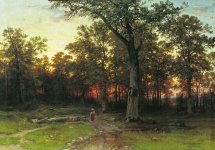
But the "grimdark feeling" is a part of the reason! The Central/Eastern Europe isn't as stark, as vibrant, as striking as some other parts of the world. The sun is usually lower, the lighting flatter, colours more subdued. The rolling landscape with small bosks and settlements is beautiful in its own right but it isn't the scenic beauty of mountainous or tropic regions.
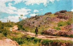
TW1 nailed it perfectly. The act with the wheat fields remains to this day the most atmospheric and memorable in the videogame history. My guess is CDPR wanted to create Velen in a similar slavic, "grimdark" vein but then somebody from global marketing or whatever said "this is too boring, let's make it more like a theme park". So with got the tropical, vibrant colours and idiotic, garish sunsets straight from Pirates of Caribbean.