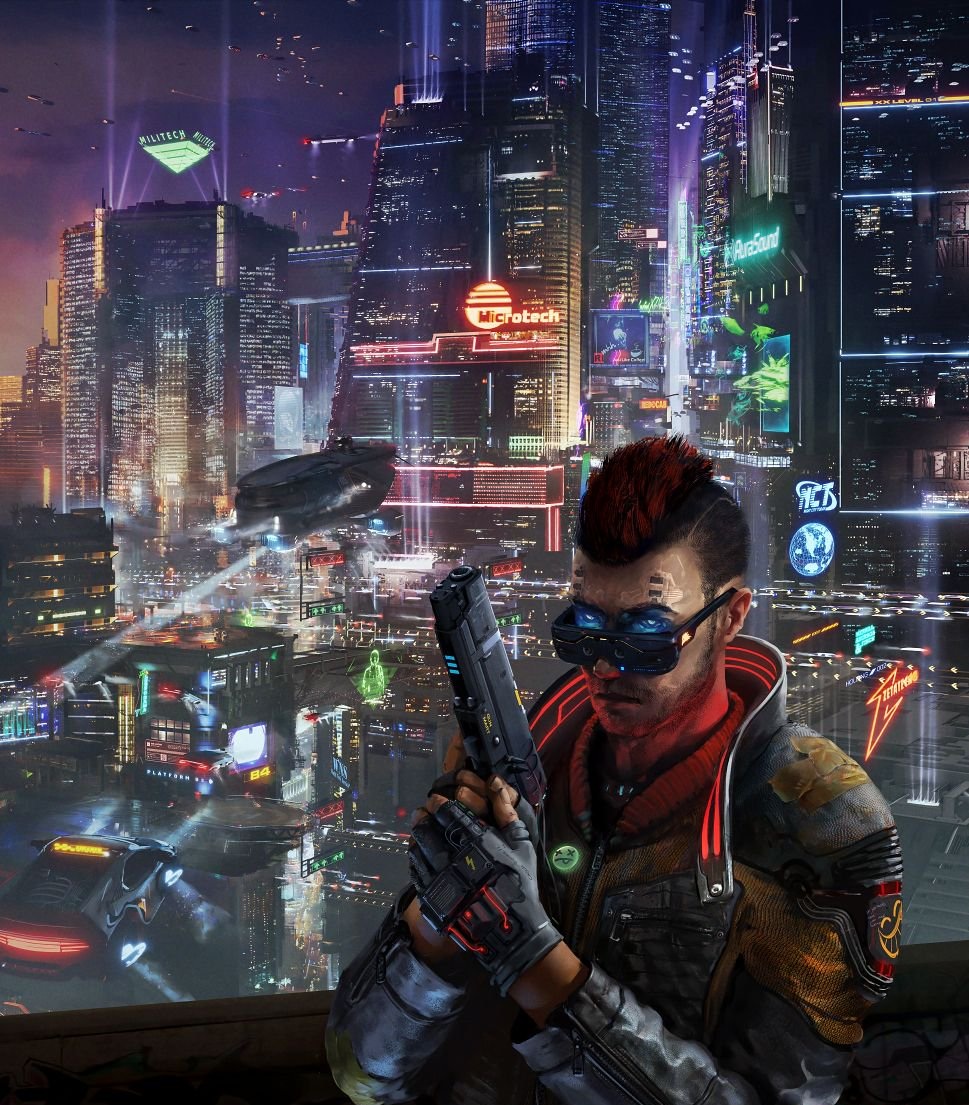
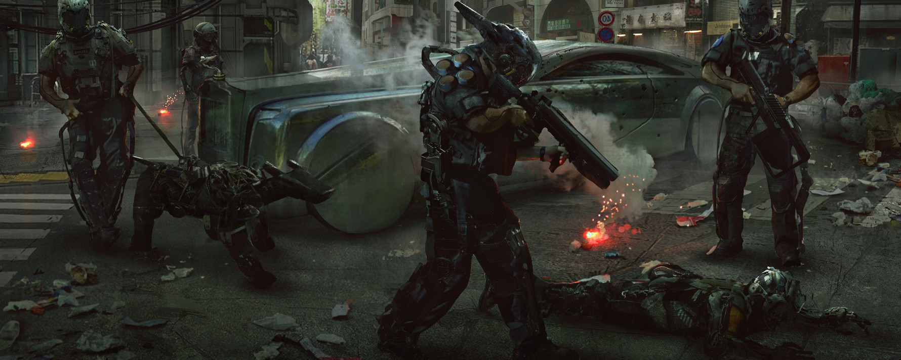
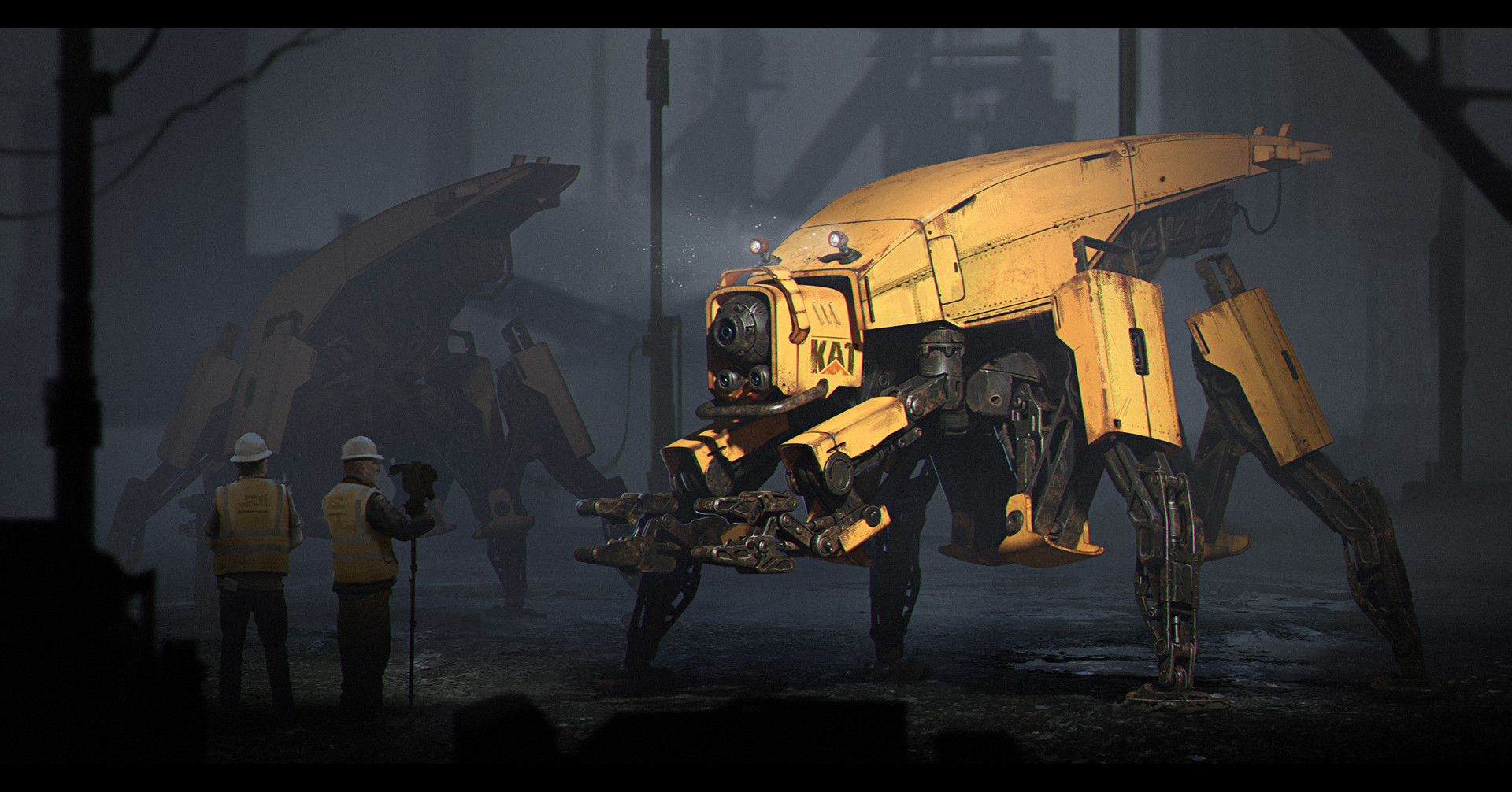
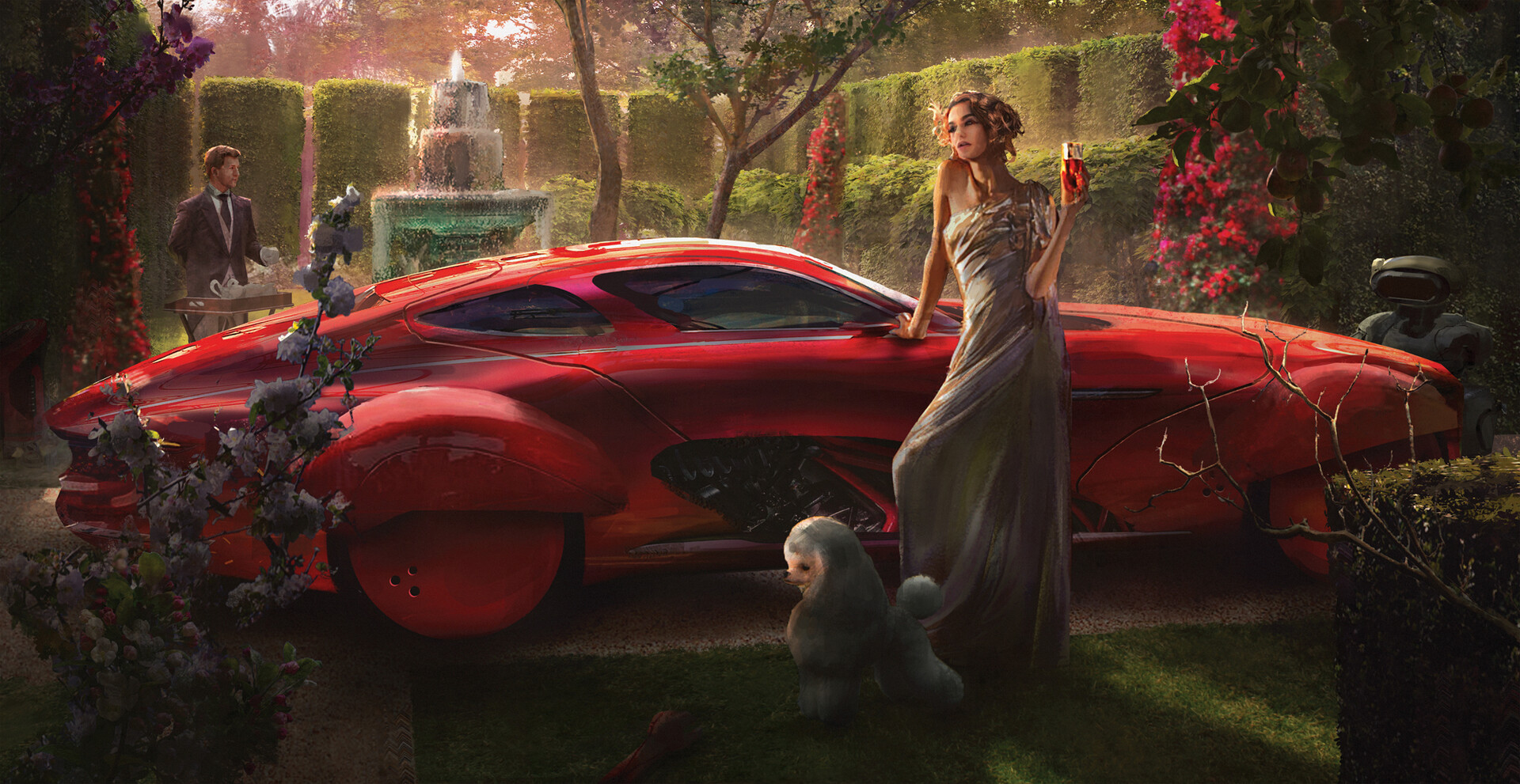
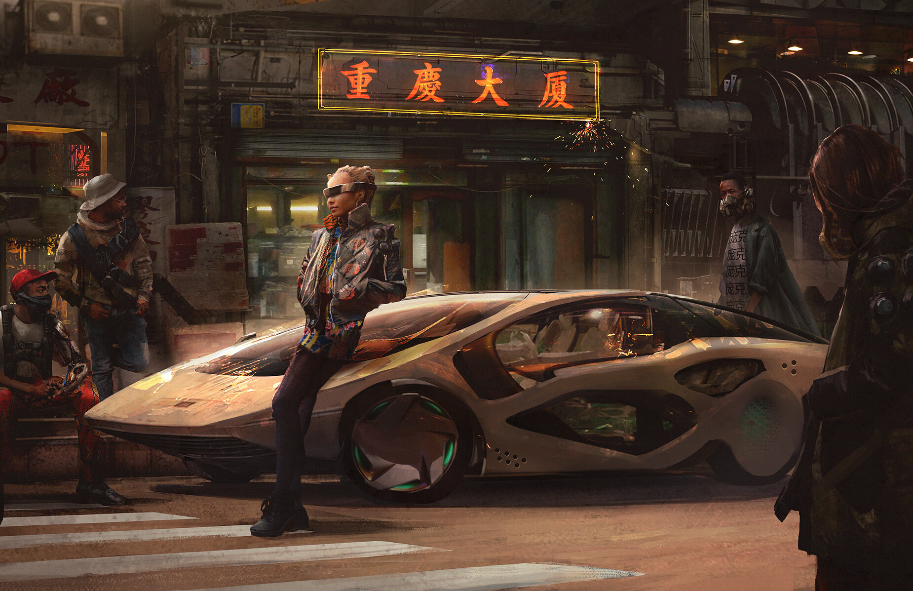
Cyberpunk RED Arts look more impressive than the CP2077 demonstration...

+
Amazing cities, more flying cars, more robots, more technology, flying motorcycle, luxury etc..
The Demo now looks bland.
Will we still see all this in other cities? :(
salvar.jpg
salvar1.jpg
jumpstartkit-br-1564456234993.jpg
angelina-stroganova-chase.jpg
eddie-mendoza-giraffe-mech-final.jpg
eddie-mendoza-the-robot-riots.jpg
maksym-harahulin-scene-1.jpg
eddie-mendoza-bourgeoisie-final.jpg
eddie-mendoza-cyberpunk-red.jpg
 
Kind of a baiting title.

2D art looks prettier than 3D actual world? Not news. CDPR 2D stuff -also- looks fancier than their actual demonstration ( from last year).

Rather than compare the two mediums, perhaps just exclaim how good these look instead?
not comparing arts with 3D
I'm talking about the content in the arts (impressive cities, more technology, more flying cars, robots etc..)
We didn't see much of it in the gameplay
Sorry my english ;-;
 
not comparing arts with 3D
I'm talking about the content in the arts (impressive cities, more technology, more flying cars, robots etc..)
We didn't see much of it in the gameplay
Sorry my english ;-;

Ah, my apologies. Misunderstood.

Yeah, you make a good point. Possibly because CDPR has to hide a lot for reveals - but also because it's easier to art stuff up for Pen and Paper than a CRPG.

I know PnP campaigns do way more than any CRPG is likely to do.

Look at it this way, though - CDPR and R.Talsorian correspond a LOT. Lots of mutual influences.
 
It’s kind of a fair point but, at the same time, a not-too-realistic one considering:
  1. The nature of Cyberpunk Red’s and 2077’s art directions, limited mostly by technical constraints (i.e. the game needs to run on current-gen consoles) in the case of 2077.
  2. The type of game CP2077 is going to be. The city center featured in some of those Red arts looks amazing but it’d also be a nightmare to explore and run if it were featured in a open world RPG with an emphasis on foot-and-ground-vehicles exploration like CP2077.
  3. It’s a demo (as you acknowledged), so there’s at least like 95% of the game still to be seen. Scenes similar to the garden or the robotic machinery could be present in the final game.
 
So far the art I have seen for RED is astounding. I really want a physical version.

I am pretty sure 2077 will be surprising for how expansive and in every direction it will be...
I love the vastness of some of the art in RED and I am hoping that is what CDPR means when they mention "verticallity".

The art just gets me more excited for what is going to be released throughout next year.
2020IRL is the year of Cyberpunk...take my money.
 
Im getting more Blade Runner vibe than Cyberpunk. Those arent very Fashionable. More like survivors. But yeah its very thin line to walk, whether you're survivor or someone whos gonna rock it. Cyberpunk should be all about rocking it. Surviving is kinda desperation, If you know what I mean.
 
Last edited:
Graphics art:
Time consuming, no budget. Only restricted to your imagination.

3D rendering
Bigger results needs bigger budget, more time needed, restricted to your tech power and knowledge.


I'm sure CDPR could do something like those sketches, but then y'all would complain you can't play it because you'd need a PC from the future to make it run.
Kinda like how there are some cuts when someone adapt a comic on screen, you have some limitations a sketche doesn't have.

Now, I honnestly prefer Cp77 style over Red, it's way too generic (gorgeous nonetheless) kind of stuff you saw 10 000times on tumblr, lacks a bit of "punk" attitude in it.
 
thank god cyberpunk 2077 looks different than those pictures. there is no way these were made with cyberpunk 2020 in mind.

https://cdnb.artstation.com/p/asset...zielonka-citywall13-finalmerge.jpg?1531947136

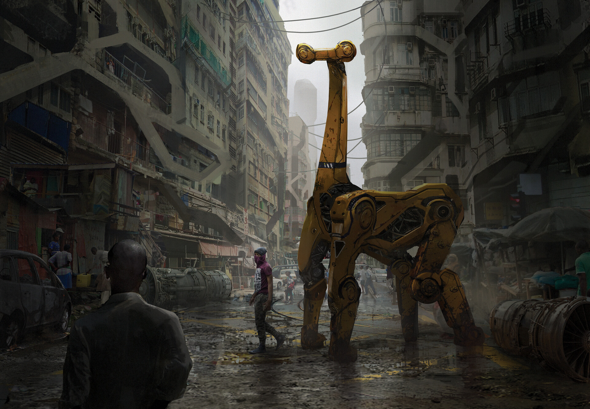
take this one for example. what are those laser rings hovering in the sky supposed to be? it looks like something out of star wars or something. these things didn't exist in 2020 and they surely won't exist in 2077. is the city in the background supposed to be night city? night city after the 4th corporate war looks like that? really? what's that cyber giraffe looking thing supposed to be?

the truth is of course that these pics weren't originally made for cyberpunk. someone just went through pictures on artstation and picked a couple random cyberpunk looking ones to put into the cyberpunk red book. that's really disappointing if you compare it to the art other pen & paper rpgs have. i'm not a huge fan of the art that's in the new shadowrun 6e sourcebook but at least there is some level of consistency. the art that's in the new shadow of the beanstalk sourcebook completly blows this away. it feels very low effort and i'm really disappointed.
 
Gotta say I agree with the last posts, I have numerous pictures saved that would look more like they belong to the world.

It feels like the cover art for the world book and box are completely different than the rest of the images. Still love it though.

They all look good and I still really want a physical copy, I can only hope it all ties into the lore somehow.
 
The word that came to mind when I browsed through the Jumpstart kit is inconsistency. These images aren't cohesive, and many of them don't even look like they belong in the same universe as 2077 or 2020. It genuinely does look like somebody just went on Artstation and (with permission) grabbed random Cyberpunk-y images to put in, as @Dr. LaBrat said.

Different images have completely different art styles.

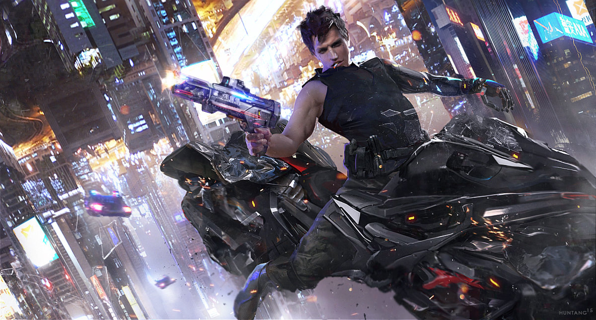
This image in particular:


Some kind of anime dude? What is he even riding? There are flying motorbikes in Cyberpunk? Not saying that's impossible, I just don't recall seeing anything like that in 2077 so far, and I don't remember it being described in 2020. I'm probably wrong. Either way, it feels off, especially when compared to this, which feels a bit more Cyberpunk (the character):


Also, holy crap @Dr. LaBrat some (at least) of these images actually WERE just pulled from Art Station! They were still created by official artists, it seems, but the images were on Art Station long before they appeared in Red. https://www.artstation.com/artwork/eAlb3

I wonder if a Talsorian employee browsed through art station, found vaguely Cyberpunk images, hired the artists, and then threw the images in. Hmm..

TL;DR, I hope this is only for the Jumpstart and not "official" artwork. The individual, hand-drawn stuff from the 2020 books -- yes, even if it's in black and white -- is far superior in my opinion. Now, in terms of general image quality (and not consistency/lore), these pictures are very very good and very cool.
 
Last edited:
Doesn't look too far from the 2077's concept arts. This is because they have to show as much content as possible with just a few images.
 
To people knocking the artwork of RED compared to 2020? This is a freaking masterpiece compared to what v3.0 had, IMO. Or would we all like to continue with the pea soup colored Robot Chicken action figure motif?
 
To people knocking the artwork of RED compared to 2020? This is a freaking masterpiece compared to what v3.0 had, IMO. Or would we all like to continue with the pea soup colored Robot Chicken action figure motif?

The quality is not what people are complaining about.
 
The quality is not what people are complaining about.
All I'm saying is that even if the art for RED was literally grabbed off of Google after typing in the word "Cyberpunk" and hitting Enter, it's still far closer to the 2020 version of Cyberpunk than v3.0 was, and anyone that compares the art honestly has to admit that.

Honestly, it wouldn't surprise me if that's what happened. Someone Googled the word "Cyberpunk" or raided Pinterest or Deviart, and just grabbed anything that looked remotely cool and sorta aligned with what the game was about. Still more easy on the eyes than v3.0, so I'm not mad at it.
Got you. Your beef is more with V3 than anything else, and I can't argue with that, that's a fair point.
 
The word that came to mind when I browsed through the Jumpstart kit is inconsistency. These images aren't cohesive, and many of them don't even look like they belong in the same universe as 2077 or 2020. It genuinely does look like somebody just went on Artstation and (with permission) grabbed random Cyberpunk-y images to put in, as @Dr. LaBrat said.

Different images have completely different art styles.

This image in particular:


Some kind of anime dude? What is he even riding? There are flying motorbikes in Cyberpunk? Not saying that's impossible, I just don't recall seeing anything like that in 2077 so far, and I don't remember it being described in 2020. I'm probably wrong. Either way, it feels off, especially when compared to this, which feels a bit more Cyberpunk (the character):


Also, holy crap @Dr. LaBrat some (at least) of these images actually WERE just pulled from Art Station! They were still created by official artists, it seems, but the images were on Art Station long before they appeared in Red. https://www.artstation.com/artwork/eAlb3

I wonder if a Talsorian employee browsed through art station, found vaguely Cyberpunk images, hired the artists, and then threw the images in. Hmm..

TL;DR, I hope this is only for the Jumpstart and not "official" artwork. The individual, hand-drawn stuff from the 2020 books -- yes, even if it's in black and white -- is far superior in my opinion. Now, in terms of general image quality (and not consistency/lore), these pictures are very very good and very cool.

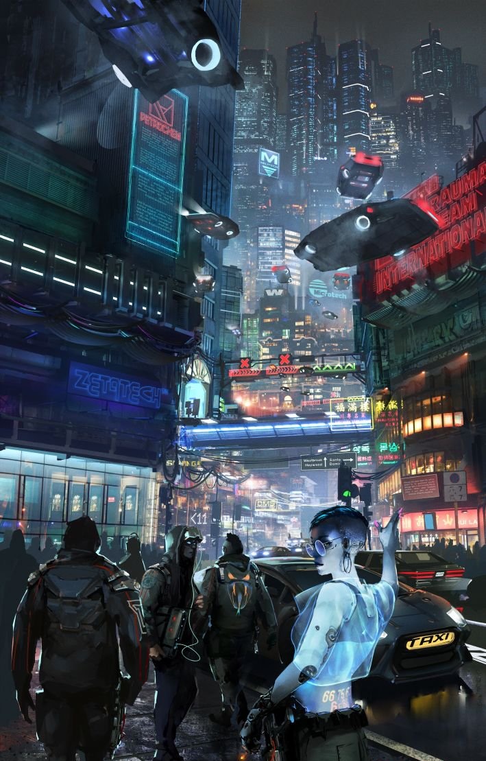
you know what's especially baffling is how the makers always made a big deal about consistency. how this bridges the gap between 2020 and 2077 and everything in this is canon but there is no consistency at least in the art at all. like i said some stuff looks straight out of star wars. some of the other art look like it belongs in a entirely different universe. the weird thing is even if you take the lazy route and just use pre existing art from artstation, you could have probably done better than that. i think i could google cyberpunk pictures on artstation and other sites that would have looked more fitting with the universe than what we got. they should have tried to hire some of the concept artists from cdpr if they really wanted consistency (and better custom made art). weird that cdpr seems to be more hands off than i thought with the whole thing even though their logo is on the cyberpunk red cover.

quality wise of course it looks better than V3, absolutly ANYTHING would have looked better than cyberpunk V3. cyberpunk red should be compared to other pnp sourcebooks which also take place in a cyberpunk setting. compare the art in red to something like shadowrun 5th or 4th edition or shadow of the beanstalk.
 
Top Bottom