Choose Cardback Screen Idea

+
I've always found both the Choose Cardback and choose Leaderskin screens a little unfriendly visually, have to slide the bar across to see the full range, can't easily see new cosmetics, I mocked up an obvious other option using the card backs.

Any thoughts on why the devs didn't go with this?
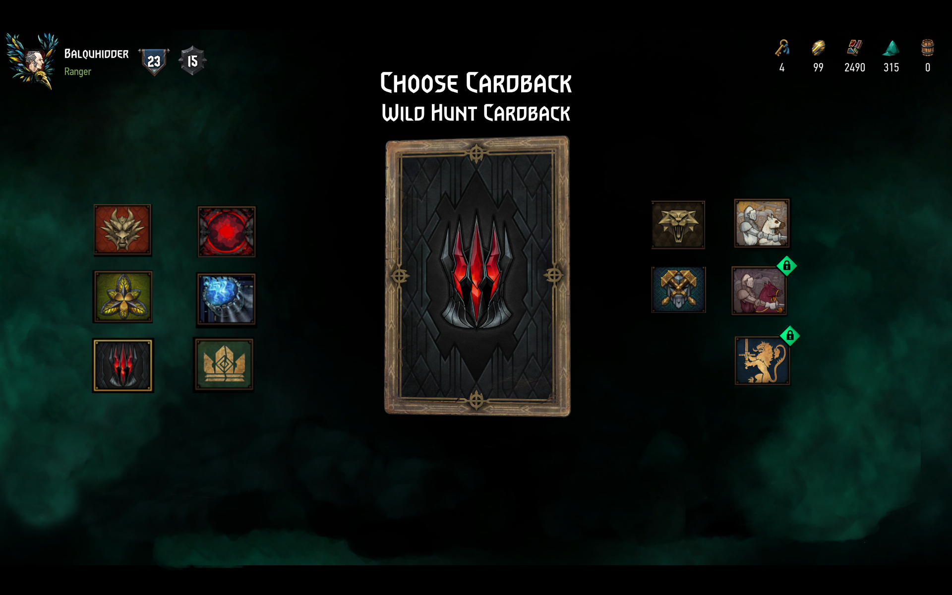
Gwent Card Back Idea.jpg
 
  • RED Point
Reactions: rrc

rrc

Forum veteran
I've always found both the Choose Cardback and choose Leaderskin screens a little unfriendly visually, have to slide the bar across to see the full range, can't easily see new cosmetics, I mocked up an obvious other option using the card backs.

Any thoughts on why the devs didn't go with this?

View attachment 11025956
It looks amazing! Why devs didn't think about it? Probably they already have these QoF things in their plates.. Initially we didn't have to scroll as there were fewer options and the horizontal bar in the bottom was perfectly fine. Kudos for the efforts!
 
Top Bottom