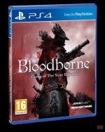
Complete Edition finally announced, but that box art...
...is pretty bad. Is this final? It's literally the same as before with an ugly yellow banner on it.
1. I think most people are smart enough to read "Complete Edition" without the need for an ugly loud yellow banner across the box. Was this really necessary? The hair even overlaps the yellow but then the words overlap the hair? Looks like a really weird design choice and amateurish.
2. Did it have to be the same box art, which many people didn't like before, and still don't especially now?
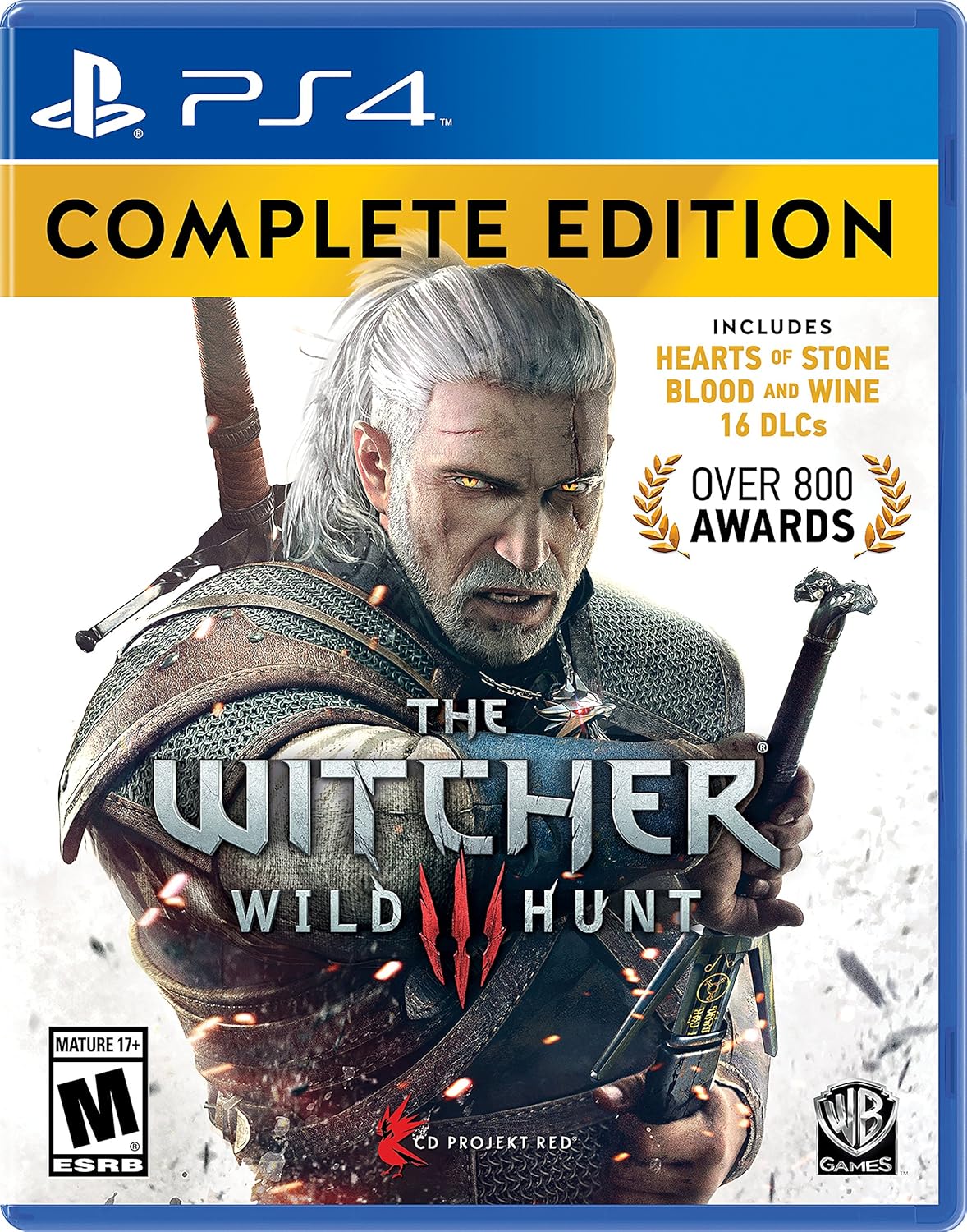
Last edited:
")