I worry about the potential lack of a unique artstyle

+
Hello guys

Just as a side note, I'm a huge cyberpunk fan and I'm super hyped up for Cyberpunk 2077, as many of you probably already know from my super-obsessive analyses.

However, I have one important reason to worry.
The artistic direction. The artstyle they're going for.

Looking at many screenshots, demos, trailers, fanarts and cosplays - I'm afraid (but I really hope I'm wrong) that the game's artstyle is going to be kind of generic.
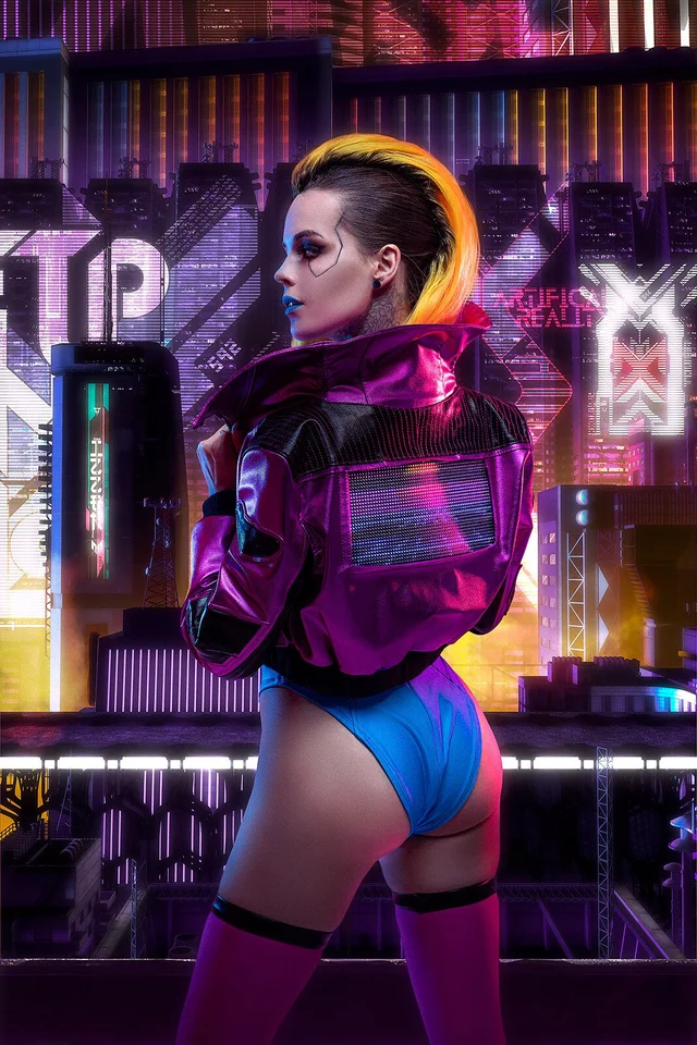
1575689479295.png


Look at this. What does this tell you about this artstyle? How does it feel?

It feels broadly cyberpunk, right? But does it feel Cyberpunk 2077? That's the question I'm asking myself.
How will Cyberpunk 2077 distance itself from other positions in the genre? Blade Runner was unique. So was GITS. So was Akira.
How is Cyberpunk 2077 going to create a cool, unique artstyle going for it that will distance it from any other generic fan-art anyone could make on DeviantArt?
Because sadly, I'm not seeing anything spectacular and "Cyberpunk 2077" if you get what I mean. I don't feel like it's the Cyberpunk 2077, I feel like it could be just titled "a cyberpunk-style character" and no one would bat an eye

Anyone having the same worries?

Cyberpunk2077-Just_another_quiet_afternoon_in_Pacifica_RGB-en[1].jpg


Look at the view over here. Why does it look so bland and washed-out? So sterile and clean, despite trying to showcase some "poverty" and dirt (I guess?)?
It really weirds me out. Am I the only one here?

Edited. -Drac
 
Last edited by a moderator:

Keive

Forum regular
Well I for one would never say that anyone could make that spectacular art work...
However, I think I understand what you're getting at, making something more stylistic, right?
I wouldn't say that Cyberpunk's style is necessarily generic, but I would say it's lightly styled realism (not fully semi-realistic, just my opinion) . You see, when it comes to a lot of games (least for me) the art style used for official game art usually hints at the actual style of the 3D (or perhaps 2D) characters/buildings/objects in the game, excluding mobile games.
I think that if I saw a game like Cyberpunk with a more stylistic art style then I would think that it would be similar to what the actual game will look like.

But we can always look forward to some fan-art if we want to see some different art styles that portray the people and the world of Cyberpunk 2077 :)
 
Was Blade Runner was unique ? Maybe the original was ? I don`t think there are many original / unique ideas in movies / art that haven`t been done before or extracted from an other idea . Someone once told me the movie Avatar was an original idea but isn`t it just a space age remake of Pocahontas ?
Image result for cyberpunk 2077 lifepath
776 × 1024

I am happy with the art of LP that has been shown to us but as you posted is it any different than you could find at DeviantArt?
 
My only "big" complain currently about the state of the visuals is that the great majority of images and videos they've shown so far look a bit too overexposed and have been compressed to a certain extent, that's why the daytime scenes look and feel washed off in parts. But I trust they'll tweak the exposure by the time the game releases, and unless one's planning on playing it on a streaming platform, there's no fear of compressed image quality in the final version of the game.

Visuals in nighttime (and dark spaces), on the other hand, are looking rich in contrasts and color variety. But we've only seen a handful of those scenes so far, so there's still lots to see yet in that regard.

When it comes to originality, well, I hope the devs are aware they'll never please everyone and, consequently, have taken a well-thought decision artwise. Some people might feel pretty satisfied with the game if it features heavy Blade-Runner-y aesthetics, some might feel that it'd be way better if the devs go for a more original take on the art direction. With what I've seen so far, though, I believe both camps will be fairly served, although their approach has been leaning more towards an eclectic originality (if that makes sense) than towards the classic purist style.
 
Was Blade Runner was unique ? Maybe the original was ? I don`t think there are many original / unique ideas in movies / art that haven`t been done before or extracted from an other idea . Someone once told me the movie Avatar was an original idea but isn`t it just a space age remake of Pocahontas ?
View attachment 11022956
776 × 1024
I am happy with the art of LP that has been shown to us but as you posted is it any different than you could find at DeviantArt?

Oh BR definitely was unique, 2049 even more so. It had great, iconic scenes that require only one glance to give away which movie they are.

These posters look great and that is the kind of style the game should have IMO but which it lacks. Look at the screenshots, demo and stuff, and then look at the posters.

I hope that the end result will look more like the posters. I remember TW3 looking blander before the release too, then in the final months they made some important visual and stylistic improvements that made the game a 10/10
 
Agreed 100% that Blade Runner was unique, and I also definitely understand where you're coming from here. I'm willing to give CDPR the chance to show me some of the more "colorful" and interesting districts, and show me their city in different weather conditions, before I decide whether or not it has a unique art style.

But I think your concerns and thoughts are entirely valid, and I'm not too far off from agreeing with you.
 

Sild

Ex-moderator
I don't feel they need to distance themselves from anything. Cyberpunk isn't an overdone genre, on the contrary, it was always a niche one. Other than a few cult hits like Blade Runner or Ghost in the Shell there's not many works that meet those two in terms of aesthetics.

I'd be delighted if the game matches Blade Runner, city scape wise, no need to go out of their way for uniqueness.

They've showed the 4 that will be present through Night City. With some, like Style over Substance reminding me of unique movies like The Fifth Element or Total Recall.

As for that pic you asked about, I'm not a fan of that particular cyberpunk look but, it is, a cornerstone style of the genre. That's why I was glad when they announced the 4 different types which to my knowlage form the arch-types of Cyberpunk aesthetics.

I think variety is a better alternative to uniqueness, in this particular case. The Witcher 3 followed a similar path, giving it a recognizable but also fresh take on visual styles of the time period.
 
View attachment 11022953

Look at the view over here. Why does it look so bland and washed-out? So sterile and clean, despite trying to showcase some "poverty" and dirt (I guess?)?
It really weirds me out. Am I the only one here?

I'm not judging art direction and style, but these pictures of outside open areas do look 'bland and washed-out'. Like out from any other SP RPG based in a modern-ish city. There is simply lack of contrast and color. On the other hand, this sort of dissipated morning/noon looks pretty much how you would expect it to look. The sun exposing all the last nights trash and empty beer cans and whatnot. I think this one might be down to the lighting.

When I saw V's apartment in the 2018 gameplay video, I felt it also looked way more clean, 'sterile' and lacked defining features that I would expect it to have if its a cyberpunks personal apartment. It looked like a hotel room or something. I expected it to look more 'lived-in'. That was almost two years ago though, and devs may have changed that since. At least they mentioned that the apartment will look different depending on your origin (and may be located in a different place too). I expect the apartment to look like a bachelor apartment... with guns.

Was Blade Runner was unique ? Maybe the original was ?
Considering the original CREATED the aesthete, I would say yes. It was. Things that followed copied it. But for the record I don't consider Blade Runner to be a cyberpunk movie. Its a dystopian future but lacks the 'punk'. Boring and bland and characters sleepwalk through the movie. For me, cyberpunk is more like the Japanese cyberpunk animes from the 80s/90s, full of attitude and crazy action instead of static shots of matte paintings.


With some, like Style over Substance reminding me of unique movies like The Fifth Element or Total Recall.
I hope you are referring to the first total recall.. Because the second one was a prime example of the "generic scifi style". Fifth element, yes. That is more like it.
Outrageous is the word you are looking for.
 
Last edited:
Uhh. No one's complaining that Games of Thrones or Lord of the Rings didn't have unique fantasy styles. It's about embodying a thematic, showing off a world in your own way, and that's not the same as every possible encounter having unique elements never ever conceived of before.
 
The whole world of Cyberpunk is dictated by these four styles

>ENTROPISM: Necessity Over Style
The look of poverty that derives from humans grappling with and struggling against technology and its unforgiving advance. It denotes a lack of design blending with a general poverty of means and ideas.

>KITSCH: Style Over Substance
The look of a long lost golden age on people entirely unwilling or unable to forget it. It’s flashy, bold and usually cheap – filled with gold-plated cyberware, implants encased in brightly colored plastic and larger-than-life makeup.

>NEOMILITARISM: Substance Over Style
The look of global conflict and corporations jockeying for power. Cold, sharp and modern. Making everyone look as if they are ready to drop out of an AV’s cargo door and head straight into combat.

>NEOKITSCH: Style And Substance
The look of infinite wealth and vanity. Synonymous with luxury, it has been blossoming among Night City’s wealthiest elites – those who can afford to buy anything, who can afford to be anything they want to be.

Each will be present in different districts/areas around Night City.
There was an awesome interview that explained how these styles evolved(were created) from 2020 to 2077, but i can't find it anymore.
Anyway, Pacifica obviously fits mostly in Entropism here so it will look more practical and bland rather than very showy.

Yeah, I referred to these styles earlier:
"These posters look great"
"I hope that the end result will look more like the posters."

I love neomilitarism so much. It looks so fkin awesome and epic. I hope Night City will deliver similar vibes and I hope the views will be similar to the backgrounds look in the posters. Entropism looks kinda like GTA 5, IMO its the least interesting, but every other poster has a super interesting background that would look great if actually implemented in the game
 
Last edited:
I would guess the clean and sterile look has partly to do with the world looking too much like ours, not futuristic and "alien" enough, lacking the dark neon flavor and sense of... strange. The ideas behind 50's to 80's scifi felt weird and intriguing back then, but now we're so close (and in some ways even past) those ideas, that it all looks very mundane and "now", and some machine limbs and faces here and there or a couple of flying vehicles don't really fix that. I also agree about the apparel of people... it doesn't really reflect very well for making the setup seem futuristic enough.

But I don't think it's necessarily to fault the artists for that; not wholesale anyway. It's kinda hard to imagine something as weird and futuristic - to compare to the 80's cyberpunk and scifi ideas and how they felt then - without it looking like it's from outer space. This is one of the reasons I had hoped they'd keep with retro futurism and made the game around 2020 instead of sidelining it the way they did.

I think, and I'd heavily suggest CDPR to do so, some adjustments to lighting, colour contrasts and the games weather (rarer straight sunshine, colour hues based on weather...) - perhaps even adding a little bit of film grain - would help greatly in getting the tone of the world more apt for the setting. I'd guess that's not too hard for them to do nor too expensive to test how it would work.
 
Why does borrowing from Blade Runner = generic? o_O
People assume that cyberpunk must look like BR. There were countless posts on this very forum about how's the 77 is NOT cyberpunk enough because there's no rain, no fog, no night, no aids and despair :) hence, BR = Generic.
 
Top Bottom