I wanted to start a thread about my experience with the interface and inventory management in CP 2077, but have 0 posts.
The inventory management in CP 2077 really hurt my experience, even though this is such a little thing. To go into inventory the player has to press I, which for some reason takes the player to a different menu and not into the inventory, then click on the inventory tab. Each of these actions involves a short animation. Then to equip an item you need to click on a slot, watch a short animation, look over the items to compare the stats, watch a short animation to go back on the main inventory screen, repeat for all other items... I am only 2 hours into the game, and I already ignore most of the loot because I can't be bothered to go into my inventory.
Also, for some reason leaving a screen (be it the inventory, the map or any other) requires two button presses, because the first Esc takes you to the menu with the Crafting, Inventory buttons and so on.
This should be streamlined in some way. For instance, pressing I should definitely take the player directly into inventory. And it wouldn't hurt to shorten the screen change animation.
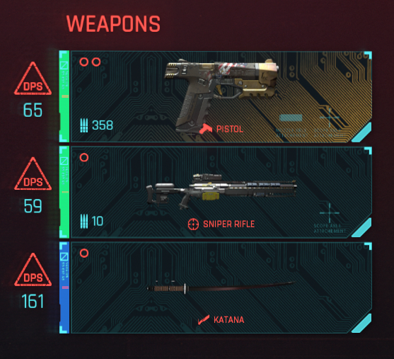
Also, there is this distinct "style over substance" vibe about all the menus. I don't mind that on the character screen, because you don't go into it often and don't mind spending some time in it to think about point allocation. But in the inventory and the journal it's just horrendous. It's very hard to see what's going on in the inventory with the red background, but then the weapons also have their own multi-colored backgrounds with small icons in the middle. This is honestly the least user-friendly inventory UI I have seen since The Witcher 1.0, when ingredients were not separated from other items. And in the journal it's just very difficult to read red text with red UI elements around. The brown UI from 2018 definitely looked less striking, but it was probably way more user friendly with its brownish color palette.
Like, just look at the attached image. There is no weapon name, the icon of the katana is barely visible, and there is really barely any meaningful information in here.
