Is this part of CP2077?

+
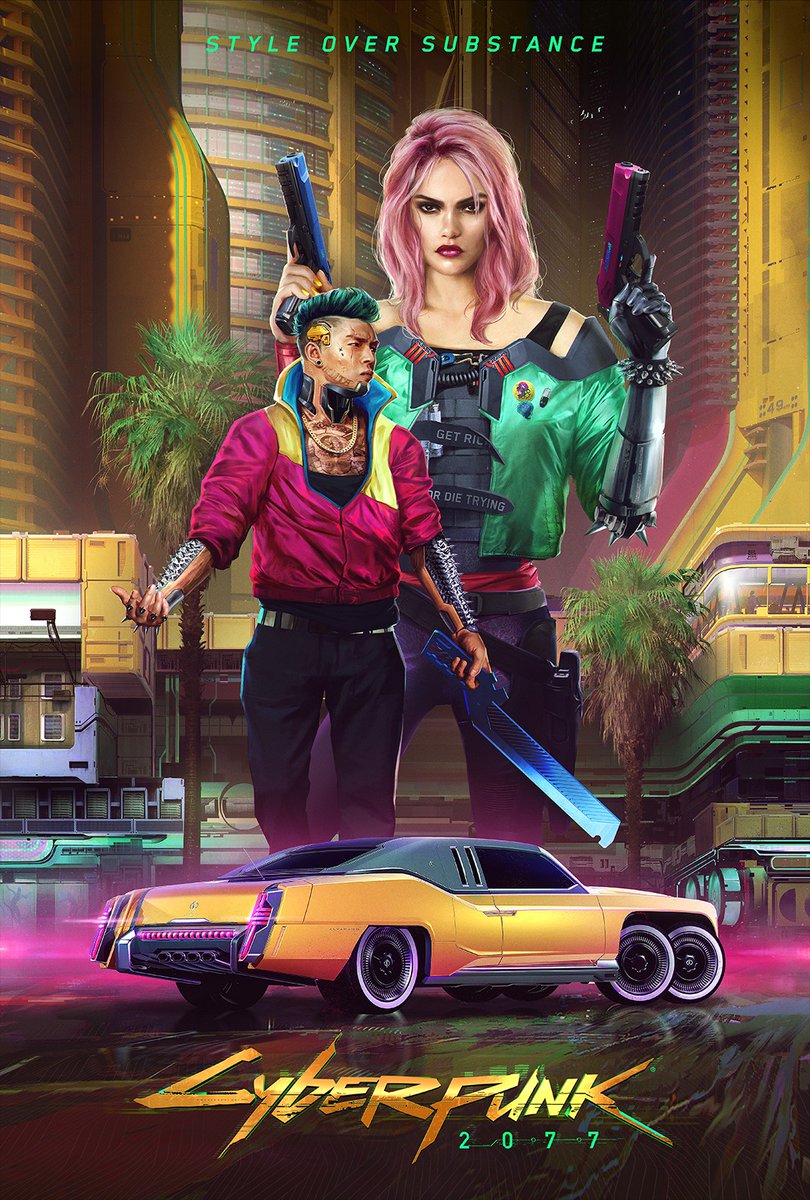
This artwork just showed up on Facebook and Twitter this morning. A Reddit user stated that this image is the poster for the movie Bushido. Does that mean that this artwork reflects the current art direction for the game. I would suspect these movies are shot in Night City. I was told by a few members of this forum that every region looks different, I didn't believe it back then but I believe it now. I strongly suspect that this is the Corporate Center and I have never seen such a perfect modernization of the 80s Cyberpunk style. Is this the case?
D9B-6BuWkAEDyut.jpg
 
It's posted on their Facebook page with a bit of description. And we've seen those attires before in previously released photos.
screen-Cyberpunk2077-Any_Last_Words-RGB-en.jpg

Post automatically merged:

It makes me wonder how many gangs we'll be seeing per district.
 
Whats wrong with this picture? I think it looks cool, fashion is big deal in Cyberpunk 2077. Sure theres gonna be those who want to look colourful.

Btw, that could me medical zone.
 
Whats wrong with this picture? I think it looks cool, fashion is big deal in Cyberpunk 2077. Sure theres gonna be those who want to look colourful.

Btw, that could me medical zone.

There is absolutely nothing wrong with it. I really hope that parts of the city looks like that. I re watched Blade Runner just the other day and realized that CD Projekt Red made the right choice by not going full on darkness. I would eventually get very sick of the perpetual night and rain
 
There is absolutely nothing wrong with it. I really hope that parts of the city looks like that. I re watched Blade Runner just the other day and realized that CD Projekt Red made the right choice by not going full on darkness. I would eventually get very sick of the perpetual night and rain

That looks more like medical zone for me, if you go to Hospital, you will see people using more brighter colours or Fire Station, Police etc. Airports are more suitable for Corp Zone imho to draw inspiration from.
 
As so often with reddit and us as Cyberpunk 2077 community. A jump to a conclusion was very fast.

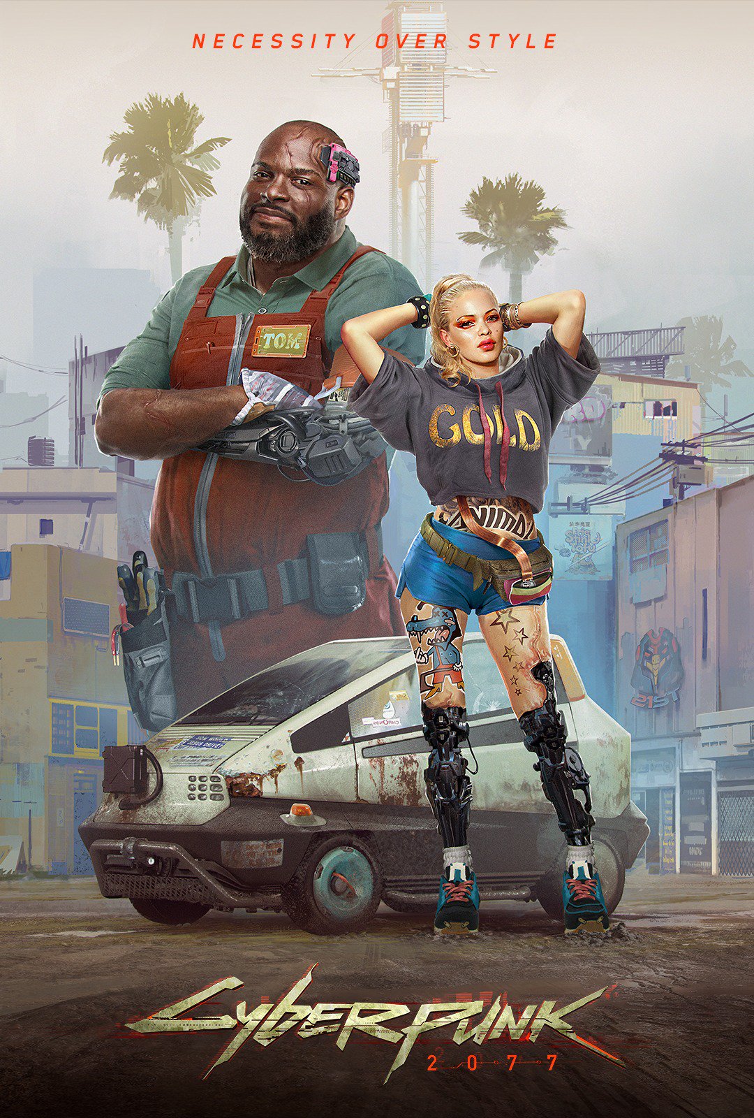
This here was the one which was posted before on the 2077 social media platforms:


>ENTROPISM
The look of poverty that derives from humans grappling with and struggling against technology and its unforgiving advance. It denotes a lack of design blending with a general poverty of means and ideas.

Miles Tost posted this about the first image:
One of the 4 art styles defining #Cyberpunk2077 visual direction.


So why was this a movie poster in last years trailer?
A simpler assumption is this: placeholder texture.
 
Top Bottom