[MOD idea] E3 2014 UI

+
[MOD idea] E3 2014 UI

Hey,

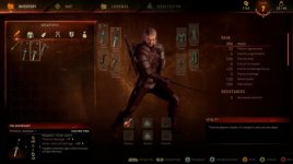
I just saw the E3 2014 Xbox-Gameplay and I think that the shown UI (1:00) was so much better than the vanilla one, especially the preperation-screen. I know that it is very hard to mod the UI, but do you guys think, it would be possible to create a similar thing?

If it is possible, there would be
5 tabs:

1. Inventory


2. Map

3. Journal

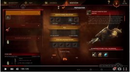
4. Meditation(Preparation)


5.Crafting //could also be a merchant-only


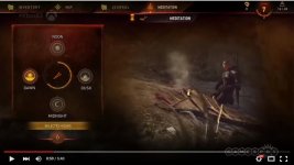
And there should also be this one:

6. Meditation start-screen


I think this is something the SOTR-team could work on, if they had not paused their development. But anyways: Do you think this is possible to achieve? And if yes: could someone please think about creating this mod? If you have any thoughts or ideas on this, please share them.

Aye,
Wookie :smiling2:
 

Attachments

  • witcher3h264-1920x1080mp4snapshot001420140615220133.jpg
    witcher3h264-1920x1080mp4snapshot001420140615220133.jpg
    34.7 KB · Views: 84
  • sdhjklgf.jpg
    sdhjklgf.jpg
    33.3 KB · Views: 210
  • asdsdsdas.jpg
    asdsdsdas.jpg
    43.5 KB · Views: 446
Last edited:
I liked that old 2014 UI so nuch better. Would definitely like it back in the game. I have no idea why CDPR had to change the UI, I don't think it's a performance hit or anything like that.
 
I liked that old 2014 UI so nuch better. Would definitely like it back in the game. I have no idea why CDPR had to change the UI, I don't think it's a performance hit or anything like that.

No they changed it because almost everyone who saw the demo was complaining about non-practical, hard to navigate and awful UI so no wonder they changed it (and I am very happy they done that). I thing the new one although is more simple is far better then the old one.
 
No they changed it because almost everyone who saw the demo was complaining about non-practical, hard to navigate and awful UI so no wonder they changed it (and I am very happy they done that). I thing the new one although is more simple is far better then the old one.

Imo there is a big difference in style of the ui (color scheme, picture etc) and layout.
I have to agree on the layout and usability part but the style part in the game now is a bummer imo not as stylish as in the old build and it would be nice to have this style back if this is doable with the modkit we have.
 
No they changed it because almost everyone who saw the demo was complaining about non-practical, hard to navigate and awful UI so no wonder they changed it (and I am very happy they done that). I thing the new one although is more simple is far better then the old one.

Old UI was not practical? Explain me in details how the new UI layout is more practical than the old one? What particular improvements over the old UI have been implemented that make the 2014 UI seem impractical in comparison?
 
Exactly. They are pretty much the same, but the old one had this awesome style and preparation screen.
 
Exactly. They are pretty much the same, but the old one had this awesome style and preparation screen.

For sure. Add to that "Tacked monster hunt" thingie with the monster description, real time meditation and animated breathing Geralt in that UI and you have a winner.
 
I am just saying what I read in comments (in YT and some game portals) after the video was published. And the main thing which I consider the most problematic are stats of weapons, bombs, etc. as they are far in the bottom and with just a little space.
 
No way. This new one is a mess on PC.
The old one was way much better for mouse and keyboard.

That's also the first thing that came to my mind. But that leads to a very slippery slope. Anyway I really hope reworking the UI is doable.

Old UI along with @essenthy's mod, volumetric clouds mod, @erxv drinking and eating animations, immersive camera mod and HD textures would definitely boost the game immersion and bring it back to how it was originally marketed. I wish there was like a unified pack of them, so that they wouldn't conflict with each other and would be packed in an installer. You could even call it 2014 Enhanced experience modpack or some such.
 
Last edited:
I've been trying to figure out how to simply change the plain black background in the UI screens, but it turns out this is no simple task. There is a menu background XBM (or something) file, but the Modkit is unable to unpack this file. Weird.

If anyone could find a way to enable us to edit the background, we'll be able to change it and I think that alone would go a long way in making the UI look more like the E3 gameplay footage.

[edit]
As a start, if we could simply replace the UI background with something more grungy, for example: http://img01.deviantart.net/4db4/i/2008/122/5/5/grunge_texture_by_struckdumb.jpg
Or
http://www.magic4walls.com/wp-conte...-brown-noise-wavy-lines-glow-tilt-unclear.jpg

...or maybe a toned down version of this that blends better, it would already make a huge difference.
Personally, I don't think the funtionality of the UI is bad. It just looks uninspired.
 
Last edited:
This thread was created in order to request a specific mod, and that is what the discussion should be about.
Not whether you prefer the current UI or the demo one. If you prefer the current UI then this mod is not for you, so you may wish to re-think continuing to post in this thread.
Constructive criticism on what you would like to see done is welcome. Simply complaining about the fact that it was changed runs the risk of derailing the discussion, which isn't likely to get your mod made.
 
Top Bottom