[Mod Request] E3 Hud

+
nahsiz33;n8465620 said:
Dunno nothing about coding and stuff, but couldn't help posting this...

The pre blood and wine gameplay hud (health, toxicity and stamina, to be precise) was *almost* identical to E3 build. So, wondering if it is possible to import those elements in v1.20 and later patches and make a modified hud.
Again, just a suggestion.
Currently following this thread like like that of STLM :p

The health-bar in E3 presentation was more narrow and seems like it had some shading on the outer edges of the red stripe.

 
nahsiz33;n8465620 said:
So, wondering if it is possible to import those elements in v1.20 and later patches and make a modified hud.

i actually made that like a year ago and posted it on the forums..


https://mega.nz/#!OpUxTZiJ!qbT1RX9Ey...NkLjgTR1VkAfe4

it was made with the old hud so some blood and wine stuff doesnt work on it...

okay.. actually the adrenaline part is completely bugged in the current version of the game.. the bars dont fill up with red when u got adrenaline and when you do something that uses adrenaline they go white and never back to normal color.... cant fix it right now since im away but someone else could probably do it.... but the smarter way to do this would be just to edit the latest version of the hud element and replace the textures with the ones similar to the old adrenaline bars..

and since in jpexs the old textures look like this:


then u just have to remake the textures instead of being able to export them from the old hud
 
Last edited:
Anglerpod;n8465720 said:
I believe it was for whatever Trophy you had equipped?

Could be exactly that. It probably was meant to be like +20 Damage points agaist Leshens if you had Leshen trophy equipped.

 
VedmakOfOld;n8465390 said:
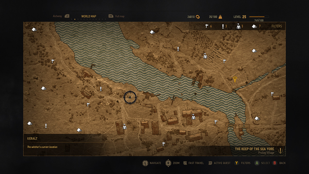
paulscotttt Maybe these waves should be the same size as the vanilla ones - the current ones are too big and make this kind of hypnotic effect but I like the color. The V2 is spot on for the zoomed in map. Also might I suggest making the rooftops more desaturated like in the reference image.

it was just a quick test, but your right but i think WalteriusMaximus Has A Better Color for the map if your going by the reference image.
maybe his map with the water image i made.
 
erxv;n8465730 said:
i actually made that like a year ago and posted it on the forums..


https://mega.nz/#!OpUxTZiJ!qbT1RX9Ey...NkLjgTR1VkAfe4

it was made with the old hud so some blood and wine stuff doesnt work on it...

okay.. actually the adrenaline part is completely bugged in the current version of the game.. the bars dont fill up with red when u got adrenaline and when you do something that uses adrenaline they go white and never back to normal color.... cant fix it right now since im away but someone else could probably do it.... but the smarter way to do this would be just to edit the latest version of the hud element and replace the textures with the ones similar to the old adrenaline bars..

That's being nitpicky I know but I think the ears on the Wolf medallion in E3 also didn't have tufts.


UPD: Nevermind me - E3 2014 Wolf medallion DID have tufts.
 
Last edited:
paulscotttt;n8465060 said:
Finished The PSD For The Mini Map Tiles

Mini Map - 9728 x 11776 - https://www.dropbox.com/s/e4m8ebwmqf...20Map.rar?dl=0

EDIT:


i have make an image that is based off the "Water" in that image.
V1 - https://www.dropbox.com/s/jlfikdlvtu...0Test.png?dl=0
V2 - https://www.dropbox.com/s/82om49l9s0...Test2.png?dl=0


Quick Test With "Water" And Recolor Of The Map.
https://www.flickr.com/photos/149209951@N04/34286549461/in/dateposted-public/lightbox/

Dude, you are evidently much better at this than me! I don't know how to add the water ripple so precisely, so if you want to make this your project, please do! I think the community here deserves the best, and between you and me, that would no doubt be you! :)
 
paulscotttt;n8465780 said:
it was just a quick test, but your right but i think WalteriusMaximus Has A Better Color for the map if your going by the reference image.
maybe his map with the water image i made.

All I did was to make the entire map greyscale and then added a tint and adjusted the brightness and contrast a bit. Very easy to replicate.
Your skill in surgically adding the water texture (no idea how you do that!) looks amazing, so please don't let me stand in your way!
 
VedmakOfOld;n8465760 said:
Could be exactly that. It probably was meant to be like +20 Damage points agaist Leshens if you had Leshen trophy equipped.


I think it was used like an oil indicator. Like you use oil against leshens and it showed that you now have 20+ dmg against leshens
 
https://youtu.be/xx8kQ4s5hCY

Well, at the beginning, when Geralt enters Novigrad, we see the noonwraith.
Later, when he travels to Crookback bog, the icon changes to fiend.
25:32, witcher is getting closer to that hill, werewolf appears.

I think it's safe to assume that the purpose of the icon is to show the most powerful/dominant monster at the territory we are in. Look, In the Novigrad we can take a witcher contract to kill the noonwraith near Drahim castle; I don't recall stronger monster in that area. Crones have a fiend on their services and it appears when we help Baron to rescue Anna. Notice that after talk with elderman, the fiend icon is still there, only when we get closer to the Whispering Hillock the icon changes. And we fight a lycanthrope.
 
K4rx20
I think it's a bonus for reading a book about leshens; you know, our knowledge increases and we deal +20 more dmg to that monster.

Another theory: At the specific time of day or weather condition leshen might be weaker.
 
it might be the sum of every extra damage we have vs leshens with books, oils, time specific stuff, potions, buffs etc...
 
Mehtih_ 's theory seems the most convincing to me regarding that monster icon and the text :)

Also regarding the health bar itself: I tried to edit some stuff but I could only change the black background and the texture regarding the toxicity part of the healthbar (the part that changes color when you are high on toxicity). I could not find a single way to edit the red part itself. I'll keep looking, I want to make the health thinner since it is way too thick for my tastes.
 
linaswas_001;n8465800 said:
Nope. For the whole time, in 35 minute gameplay video Geralt has Griffins head equiped. Also, check it https://youtu.be/xx8kQ4s5hCY?t=27 . At the very beginning, it shows Noonwraith. Maybe it shows closest monster?

I think linaswas_001 is also onto something. When Geralt returns with Johnny and his newfound voice to the old lady (the Crones proxy) we see none other than a fiend walking close-by and making beastly noises.

 
VedmakOfOld You have an eagle eye, sir.

So, if the version with nearest monster is true, than it only counts stronger / rarer enemies. Now, which creatures count as them? What if, like in Skellige, the tresure is guarded by a golem and two gargoyles, which ones are shown?

Honestly I fully understand why this element was cut, it didn't make any sense in the form it was.
 
Yes probably not worth implementing again... unless someone is able to bind a new useful feature to it.
 
Mehtih_;n8467330 said:
VedmakOfOld You have an eagle eye, sir.

So, if the version with nearest monster is true, than it only counts stronger / rarer enemies. Now, which creatures count as them? What if, like in Skellige, the tresure is guarded by a golem and two gargoyles, which ones are shown?

Honestly I fully understand why this element was cut, it didn't make any sense in the form it was.

Thank you! Yep, a not fully-realized feature but all other elements of the UI (the map, tabs,Inventory tab in particular with Geralt in a fighting stance, UI background etc.) are definitely worth fighting for. I liked how the bestiary articles were basically integrated into the preparation submenu of the Meditation tab.Too bad we have never seen how the Journal tab looked, I bet it was the initial tab for quests and such.

 
Top Bottom