


New CD Projekt RED logo!
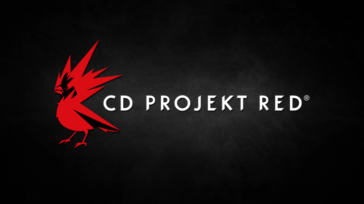
Established in 2002, located in Warsaw (HQ) and Kraków, Poland, CD Projekt RED was born out of raw passion to video games. The studio’s founders--Michał Kiciński and Marcin Iwiński, both pioneers in video game distribution in Poland in the 90s, decided to employ their gaming industry experience in video game development. A lot of time has passed since 2002, and the studio’s logo remained mostly untouched. Until today.
The new logo is a combination of energy and passion for game-making the studio is known for. This is how Adam Badowski, CD Projekt RED’s Head of Studio, sees the change:
We are rebels and rebels are free. Just like birds. The Northern Cardinal is what we see ourselves in the industry: intrepid, bold and confident; flying high and aiming even higher. The colour, cardinal RED, is something that connects it with another bird, a mythological creature close to our cultural roots and heritage--the Raróg, a small firebird believed to bring luck to people. RED stands for energy, the inner fire that drives us; it represents something very close to everyone here in the studio--the creativity and passion we harness from within ourselves to make the best RPGs in the world.
Starting May 14th, the Cardinal logo will become the new, official logo of CD Projekt RED--it will accompany all official assets and will form the core of the studio’s visual identification.
Last edited:

")


