


You are using an out of date browser. It may not display this or other websites correctly.
You should upgrade or use an alternative browser.
You should upgrade or use an alternative browser.
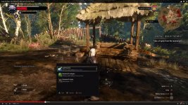
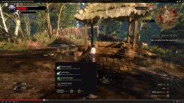
I thought somehing like this - the picture below shows how the menus were in the older builds of the game and they seemed to be more easily to navigade with mouse and keyboard
Easy to navigate with mouse - let's say you're in inventory, and you want to go to Journal - one click with the mouse and you're there.. easy
Because as is seems right now in the newest video, if you want to go let say from the Inventory screen to Map or Journal with the mouse, you need to click the arrrow (left or right) button, and you need to go through other menus till you find the one wanted.. it just isn't practical.. with gamepad you have no other option, but with mouse you have the freedom to do it, so it would be great to have the option like a PC version of a RPG should have had
Attachments
-
 gfggggg.jpg16.7 KB · Views: 58
Last edited:
Even Bioware uploaded a video specificially about the PC version of DAI version before they game was released. You won't be worse than Bioware, will you, CDPR?
And no, I don't talk about Pc graphics. I talk about things that really matter for that platform...
---------- Updated at 12:33 AM ----------
I hope we will be able to turn off ALL button prompts in the PC version. I mean, they're ok for absolute game noobs. I can map them myself in the settings and remember them. I don't want to see them anywhere, neither on the general screen nor in the menus like the inventory.
By the way, did you see some of the rarely appearing PC/keyboard buttons prompts in the youtube videos?. Like here in AngryJoe's (original, unedited stuff):
Xbox Controller prompts:
View attachment 13119
Keyboard prompts:
View attachment 13120
I hope THAT's not how the final PC version will look like with just 1to1 incredibly ugly transformed button prompts as if standard best-use practices for PC UIs didn't exist. I guess there is a good reason why they didn't want to show people the M/K controls and UI so far.
You know, in PC UIs dynamic screens are usually closed with clicking on a little "X" in the upper right corner. Best use practice. And button prompts for mouse/keyboard are usually nicely integrated in the general UI aesthetics and not a foreign body in the whole thing. Also if you play with a mouse/keyboard you usually don't play at a big TV but at a PC monitor. So the button prompts shouldn't be bigger than the actual information in the screen. And usually in a PC game that use best-use standards you can do everything just with the mouse in menus. I don't see how that stuff is designed for mouse-only usage. It's the opposite. It seems to be created for keyboard only usage, like a 1to1 transformation of controller input, basically just a name/button prompt change...
I mean, honestly, who created that crap? And I mean it: that PC button prompts in the picture above are CRAP and I really hope they are just temporary (I just don't know why they would still use such bad temporary things four weeks before release...)

---------- Updated at 02:06 AM ----------
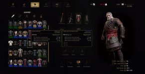
So, I re-desinged the final inventory for PC usage:
Original inventory (shot taken from last gameplay trailer):
View attachment 13124
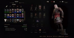
Re-desinged inventory for PC or M/K:
View attachment 13123
Changelog:
I'm still not really satisfied with the stats box in the lower right corner. The position of that information just doesn't fit the overall design and feels like a foreign body there (not just in my re-design but already in the original one) because it overlaps with the 3D model and isn't alinged with any other element of the inventory. Maybe making Geralt's 3D model a bit smaller and putting the information above the model (maybe in two rows instead of five) would look and feel much better...
And no, I don't talk about Pc graphics. I talk about things that really matter for that platform...
---------- Updated at 12:33 AM ----------
I hope we will be able to turn off ALL button prompts in the PC version. I mean, they're ok for absolute game noobs. I can map them myself in the settings and remember them. I don't want to see them anywhere, neither on the general screen nor in the menus like the inventory.
By the way, did you see some of the rarely appearing PC/keyboard buttons prompts in the youtube videos?. Like here in AngryJoe's (original, unedited stuff):
Xbox Controller prompts:
View attachment 13119
Keyboard prompts:
View attachment 13120
I hope THAT's not how the final PC version will look like with just 1to1 incredibly ugly transformed button prompts as if standard best-use practices for PC UIs didn't exist. I guess there is a good reason why they didn't want to show people the M/K controls and UI so far.
You know, in PC UIs dynamic screens are usually closed with clicking on a little "X" in the upper right corner. Best use practice. And button prompts for mouse/keyboard are usually nicely integrated in the general UI aesthetics and not a foreign body in the whole thing. Also if you play with a mouse/keyboard you usually don't play at a big TV but at a PC monitor. So the button prompts shouldn't be bigger than the actual information in the screen. And usually in a PC game that use best-use standards you can do everything just with the mouse in menus. I don't see how that stuff is designed for mouse-only usage. It's the opposite. It seems to be created for keyboard only usage, like a 1to1 transformation of controller input, basically just a name/button prompt change...
I mean, honestly, who created that crap? And I mean it: that PC button prompts in the picture above are CRAP and I really hope they are just temporary (I just don't know why they would still use such bad temporary things four weeks before release...)
---------- Updated at 02:06 AM ----------
So, I re-desinged the final inventory for PC usage:
Original inventory (shot taken from last gameplay trailer):
View attachment 13124
Re-desinged inventory for PC or M/K:
View attachment 13123
Changelog:
- mouseover equipment comparison instead of information box in the lower left edge (full stats comparison now possible because stats buffs of both the equipped item and the compared item visible now at the same time)
- completely redone menu structure for mouse usage in the upper left edge for direct mouse access instead of button toggling (design taken from ingame menu selection with controllers, button toggling unnecessary because of hotkeys)
- removed button prompts in the lower right corner (PC users don't need that, most stuff is done with the mouse anyway and we're not stupid and we can remember the keys we've chosen...)
- bigger inventory grid on screen (possible because the equipment information box was removed thanks to mouseover comparison)
I'm still not really satisfied with the stats box in the lower right corner. The position of that information just doesn't fit the overall design and feels like a foreign body there (not just in my re-design but already in the original one) because it overlaps with the 3D model and isn't alinged with any other element of the inventory. Maybe making Geralt's 3D model a bit smaller and putting the information above the model (maybe in two rows instead of five) would look and feel much better...
Attachments
-
 button prompts xbox.jpg307.3 KB · Views: 63
 -
 button prompts.jpg312.7 KB · Views: 104
 -
 better pc ui condensed final.jpg182.7 KB · Views: 71
 -
 original inventory console.jpg158.2 KB · Views: 69
Last edited:
Even Bioware uploaded a video specificially about the PC version of DAI version before they game was released. You won't be worse than Bioware, will you, CDPR?
And no, I don't talk about Pc graphics. I talk about things that really matter for that platform...
---------- Updated at 12:33 AM ----------
I hope we will be able to turn off ALL button prompts in the PC version. I mean, they're ok for absolute game noobs. I can map them myself in the settings and remember them. I don't want to see them anywhere, neither on the general screen nor in the menus like the inventory.
By the way, did you see some of the rarely appearing PC/keyboard buttons prompts in the youtube videos?. Like here in AngryJoe's (original, unedited stuff):
Xbox Controller prompts:
View attachment 13119
Keyboard prompts:
View attachment 13120
I hope THAT's not how the final PC version will look like with just 1to1 incredibly ugly transformed button prompts as if standard best-use practices for PC UIs didn't exist. I guess there is a good reason why they didn't want to show people the M/K controls and UI so far.
You know, in PC UIs dynamic screens are usually closed with clicking on a little "X" in the upper right corner. Best use practice. And button prompts for mouse/keyboard are usually nicely integrated in the general UI aesthetics and not a foreign body in the whole thing. Also if you play with a mouse/keyboard you usually don't play at a big TV but at a PC monitor. So the button prompts shouldn't be bigger than the actual information in the screen. And usually in a PC game that use best-use standards you can do everything just with the mouse in menus. I don't see how that stuff is designed for mouse-only usage. It's the opposite. It seems to be created for keyboard only usage, like a 1to1 transformation of controller input, basically just a name/button prompt change...
I mean, honestly, who created that crap? And I mean it: that PC button prompts in the picture above are CRAP and I really hope they are just temporary (I just don't know why they would still use such bad temporary things four weeks before release...)
---------- Updated at 02:06 AM ----------
So, I re-desinged the final inventory for PC usage:
Original inventory (shot taken from last gameplay trailer):
View attachment 13124
Re-desinged inventory for PC or M/K:
View attachment 13123
Changelog:
- mouseover equipment comparison instead of information box in the lower left edge (real comparion now with visible buffs)
- menu structure for mouse usage in the upper left edge for direct mouse access instead of button toggling (design originally from ingame menu selection)
- removed button prompts in the lower right corner (PC users don't need that, most stuff is done with the mouse anyway)
- biggerinventory grid on screen (because the information was removed thanks to mouseover comparison)
I'm still not really satisfied with the stats in the lower right corner. The position of that information just doesn't fit the overall design and feels like a foreign body there (not just in my re-design but already in the original one). Maybe making Geralt's 3D model a bit smaller and putting the information above the model (maybe in two rows instead of five) would look and feel much better...
Yeah man, your design is a great PC menu system
I don't care about the infor in the right corner.. if this would be the real PC menu, I would be so happy.. Now I just hope that someone can make a UI mod like this after the game releaseYeah man, your design is a great PC menu system
Thanks! I honestly hope that won't be necessary and CDPR will show us a similar UI for M/K soon. Let's give them the benefit of the doubt and let's hope that what they showed so far was indeed just a placeholder for M/K usage/controls/UI...
If not, mod your design in Scholdarr. Seriously. It looks phenomenal
Edit: No offense to the RED designer who did the original design; but it's inherently bad for KB/M because of its hybrid nature, not because it is a bad design by itself. But this custom UI is really good for KB/M.
Edit: No offense to the RED designer who did the original design; but it's inherently bad for KB/M because of its hybrid nature, not because it is a bad design by itself. But this custom UI is really good for KB/M.
Last edited:
Even Bioware uploaded a video specificially about the PC version of DAI version before they game was released. You won't be worse than Bioware, will you, CDPR?
And no, I don't talk about Pc graphics. I talk about things that really matter for that platform...
---------- Updated at 12:33 AM ----------
I hope we will be able to turn off ALL button prompts in the PC version. I mean, they're ok for absolute game noobs. I can map them myself in the settings and remember them. I don't want to see them anywhere, neither on the general screen nor in the menus like the inventory.
By the way, did you see some of the rarely appearing PC/keyboard buttons prompts in the youtube videos?. Like here in AngryJoe's (original, unedited stuff):
Xbox Controller prompts:
View attachment 13119
Keyboard prompts:
View attachment 13120
I hope THAT's not how the final PC version will look like with just 1to1 incredibly ugly transformed button prompts as if standard best-use practices for PC UIs didn't exist. I guess there is a good reason why they didn't want to show people the M/K controls and UI so far.
You know, in PC UIs dynamic screens are usually closed with clicking on a little "X" in the upper right corner. Best use practice. And button prompts for mouse/keyboard are usually nicely integrated in the general UI aesthetics and not a foreign body in the whole thing. Also if you play with a mouse/keyboard you usually don't play at a big TV but at a PC monitor. So the button prompts shouldn't be bigger than the actual information in the screen. And usually in a PC game that use best-use standards you can do everything just with the mouse in menus. I don't see how that stuff is designed for mouse-only usage. It's the opposite. It seems to be created for keyboard only usage, like a 1to1 transformation of controller input, basically just a name/button prompt change...
I mean, honestly, who created that crap? And I mean it: that PC button prompts in the picture above are CRAP and I really hope they are just temporary (I just don't know why they would still use such bad temporary things four weeks before release...)
---------- Updated at 02:06 AM ----------
So, I re-desinged the final inventory for PC usage:
Original inventory (shot taken from last gameplay trailer):
View attachment 13124
Re-desinged inventory for PC or M/K:
View attachment 13123
Changelog:
- mouseover equipment comparison instead of information box in the lower left edge (full stats comparison now possible because stats buffs of both the equipped item and the compared item visible now at the same time)
- completely redone menu structure for mouse usage in the upper left edge for direct mouse access instead of button toggling (design taken from ingame menu selection with controllers, button toggling unnecessary because of hotkeys)
- removed button prompts in the lower right corner (PC users don't need that, most stuff is done with the mouse anyway and we're not stupid and we can remember the keys we've chosen...)
- bigger inventory grid on screen (possible because the equipment information box was removed thanks to mouseover comparison)
I'm still not really satisfied with the stats box in the lower right corner. The position of that information just doesn't fit the overall design and feels like a foreign body there (not just in my re-design but already in the original one) because it overlaps with the 3D model and isn't alinged with any other element of the inventory. Maybe making Geralt's 3D model a bit smaller and putting the information above the model (maybe in two rows instead of five) would look and feel much better...
Your design is really awesome and functional. They should hire you.
Oh, I forgot a small detail. There should of course be the standard closing "X" button in the very upper right corner if you desire to close the menu with a simple mouse click (pressing "ESC" should of course work as well, with no visible button prompt needed).
@Scholdarr.452
I think its good but only slightly improved. The thing thats nice about it is that it looks thought for PC, but that doesnt really translate to practice with more efficient use aside from a few clicks less needed.
I think the situation right now from many posters is an emotional response to CDPR's lack of apparent "care" for the PC controls and interface (which I support), but in practice? I dont think its so much different.
For a small constructive criticism: add back the bottom left item info, or make a way for items to be able to be compared without equipping them, otherwise just tool tips remove functionality. The info that's "locked" in place for doing other things parallel to it should not be a tooltip that covers other stuff, where ever you want to put it. And you might want to add the full name of each equipped item close to their icons, so one can see all that one's using, identify it and memorize the names easily.
Thanks for the effort, I have plenty of ideas to improve the whole thing but im lazy to show them so its nice that you do this. I'll give you one of them though, in case you want to try it: think of maximum control and effectiveness, combine the inventory + crafting and alchemy + full player stats + a brief reminder of equipped active skills.
I did it once based on the old design of the menus (without the skills), and it was totally doable imo, and god it felt nice to open the thing and feel like its the "geralt base of operations" hehe, with all strategical planning and data organized and interacting with each other. It also had a nice Witcher 1 like art but I didnt saved it, just went to eat it something and turned off the PC.
Actually now you got me thinking, do we even know there arent tooltips with he mouse in the official inventory? I think its totally possible.
Anyway keep the iterations going
Last edited:
I honestly don't know what you mean. My mock-up work exactly like you describe it here. It's a mouse-over comparsion, so you don't have to equip anything for comparison. Just move the mouse over items in your inventory grid and the mouse-over tooltip open automatically. If it's an equippable item the currently equipped item is also automatically shown right besides it for comparison.@Scholdarr.452
For a small constructive criticism: add back the bottom left item info, or make a way for items to be able to be compared without equipping them, otherwise just tool tips remove functionality. The info that's "locked" in place for doing other things parallel to it should not be a tooltip that covers other stuff, where ever you want to put it. And you might want to add the full name of each equipped item close to their icons, so one can see all that one's using, identify it and memorize the names easily.
And because it's just a mouse-over the tooltip doesn't cover other stuff. It disappears once your mouse pointer leaves the item and the inventory grid on the left.
I don't know what you mean with the names. They are shown in the mouse-over tooltip once you move your mouse pointer above the respective item. That's how a standard PC inventory works. You usually use the mouse with full freedom of movement and fast selection, no need for an awkward and slow solution that works like controller where you have to toggle through every single item...
What the hell is wrong with all of you? I think that thoose kind of statements like "CDPR is the same road as the Bioware", otór "They forgot about the PC Community". It is a real shame. I think the M-KB controlls will be just fine, but IF somehow CDPR have did not really made it as good as you expect there will be FULL mod support, so you can tweak things. Did you forgot this? @Scholdarr.452's invertory degsin is looks good, and I expect even more and better later on as the new REDkit will launch.
What the hell is wrong with all of you? I think that thoose kind of statements like "CDPR is the same road as the Bioware", otór "They forgot about the PC Community". It is a real shame. I think the M-KB controlls will be just fine, but IF somehow CDPR have did not really made it as good as you expect there will be FULL mod support, so you can tweak things. Did you forgot this? @Scholdarr.452's invertory degsin is looks good, and I expect even more and better later on as the new REDkit will launch.
Real shame is silence from dev's. And the fact that they've made UI thinking about controller not K/M. And there is nothing wrong that people are asking questions and lose faith after no answers and streams and videos with only controller. Hell they even forbid Youtubers to use K/M. What you expect? Still think that everything is fine and everything will be OK? I doubt this as many others. And so far CDPR haven't done a thing to prove me been wrong. Sure we can't demand from them to answer or show us something. If they don't want it's their choice. If they want to hide some problems untill release it's their choice. I just think it's not totally fair towards PC players.
Real shame is silence from dev's. And the fact that they've made UI thinking about controller not K/M. And there is nothing wrong that people are asking questions and lose faith after no answers and streams and videos with only controller. Hell they even forbid Youtubers to use K/M. What you expect? Still think that everything is fine and everything will be OK? I doubt this as many others. And so far CDPR haven't done a thing to prove me been wrong. Sure we can't demand from them to answer or show us something. If they don't want it's their choice. If they want to hide some problems untill release it's their choice. I just think it's not totally fair towards PC players.
What if the UI works for both, controllers and M+K? Crazy, right?
I personally don't see a problem with the UI, it looks good. Yes, there could be tweaks specifically for M+K, but the current one looks like it's working pretty good.
For the youtubers using controllers, one of them said that in the build that they were playing, there was a bug with the mouse controls, so they had to use controllers, nothing too nefarious.
Also CDPR have no obligation to prove you wrong or answer the moment you ask. Yes, I think everything is fine.
I'm also a PC player, but I don't see a problem. The controls will be fine until proven otherwise, why you choose to freak out is your business, but you should just relax and stop worrying.
Let's for the sake of argument assume that there is a problem on release, CDPR have always had great support for their games, so any issues will be resolved in a timely manner.
View Poll Results: Which game controller(s) will you use on PC?Voters 64. You have already voted on this poll (delete vote)
Xbox One 9- -14.06%
PlayStation 4 10 - 15.63%
Keyboard & Mouse 37 - 57.81%
Have not decided yet 8- -12.50%
Maybe... only maybe is because there's a majority of people playing PC with KB+M... who knows.
That is the problem. The UI must work for both but there is a big difference between creating it for K/M and adapting for controller and creating it for controller and adapting it for K/M. And it looks like it was created for controller. And it mean that PC players will suffer from this decision.What if the UI works for both, controllers and M+K? Crazy, right?
That is the problem. The UI must work for both but there is a big difference between creating it for K/M and adapting for controller and creating it for controller and adapting it for K/M. And it looks like it was created for controller. And it mean that PC players will suffer from this decision.
And which game developer team made a seperate UI for the PC port only?
I still cannot see reason to not belive to CDPR, in fact it is seems to be a little fire with HUGE smoke, and the end of the day will turns out that there is NO problem with the M-KB controll.
Not seperate. Sigh... every developer when start doing games for consoles forget about their PC players. I don't know why. But the fact is that with controller support they begin to make UI for controller and then make crap port for K/M. Maybe because in the end they sell more copies of their game on consoles... but it's sad that former PC dev studio is showing their new game only with controller. And comments like "I've never played with K/M but after reading this thread I've tried it and it works for me" makes me wonder why all of sudden people working at CDPR abandon K/M and start using controller? Is it so superior? Maybe I'm missing something...
PC port only?
It's not a PC port.
---------- Updated at 02:33 PM ----------
Keyboard prompts:
View attachment 13120
I didn't saw this before. You have to press E to take a single item? So...you can't navigate in the "loot menu" with mouse?