Sorry for created topic in the wrong room. Like new on the forum, I can only here. And for my English, is not my native language.
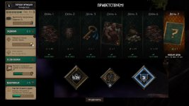
1. The circle of seasons.
It would be cool if the game had the opportunity to see a list of all the seasons and their rewards at any time. Of course, it would be possible to invest RP points only in the current season, the rest can only be viewed.

https://www.reddit.com/r/gwent/comments/bkdx23 - The concept is taken from here, for which many thanks to the author.
2. Pro instead of zero.
It seems like we reach the Pro rank, but this nasty 0 is displayed everywhere. Is it difficult to redraw the rank badge to write Pro instead of 0. After all, how nice it is when in the game profile in the line the highest achieved rank will display an icon with the word Pro instead of an incomprehensible 0. Also 0 is incomprehensible to new players.


3. Cardback style.
It would be nice if the game had cardbacks in other styles. Those that are now (except for the New Year) look very similar. Especially seasonal. Yes, and this style, not everyone likes.
4. Events.
More events. But with rewards independent of pure random. Like in beta, when you know what you need to do to get a reward.
5. Arena rework.
6. Do not discount cosmetic rewards.
Many people like to collect cosmetics. From part on this, the monetization of the game is built. But for some reason, there is a tendency to redraw existing cosmetics in a different color and its subsequent sale (Yes, we are talking about cardbacks with pre-order, Yule event. About the borders from the Shupe challenge, which were then sold all together, but in different colors). Hackwork. Collapses the process of collection. Why should I buy something with a pre-order, if later it will be possible to buy something similar at any time. Thus, the original cosmetics loses its collection. Repainted looks second-rate. This is not the way CD Project Red should go. This is the way third-rate MMO from China. Better less cosmetics, but original.
7. About the card rework.
Every day we see new posts about card reworks. But we are no longer in beta. Playable decks consist of 25 cards. Each faction has hundreds of cards. Moreover, each fraction has only a few archetypes. Using simple mathematics, we get how you don’t change cards; you won’t push everything into the deck. There will always be cards that will be played the least. Why need rework the card if it does not play? What will change from this? Another card will not play. On the other hand, we have almost no meme or funny cards. There are few situational cards left. But a bunch of monotonous cards. Do not rework the cards. Make new archetypes, new modes, where these cards will sparkle. Introduce new cards in conjunction with which the old will play. In all card games there are cards that almost do not play, fillers. Sometimes they play in special modes. But only in the gwent, if there is a card that does not play, it must be reworked, along the way, killing a meme deck, a subset of the archetype, and another card. Want to make a new card? Type with a new addon. Do not touch the old ones, even if they don’t play.
8. But still, finally change Ciri: Nova.
9. Animated tokens.
We know animated tokens are economically disadvantageous. But players are asked to add them. Start a few with the new add-on. After some time, only the tokens of the current add-on will remain animated.
10. Cosmetics collection tab.
Make a separate menu with all the existing cosmetics in the game. Perhaps just in the main menu, near the collection, add the makeup collection tab. Where it will be convenient to consider all cardbacks. In full format, and not the cubes that are now before the start of the match. With a convenient full-screen layout. All existing borders, avatars and titles. Previously, Projects said it was hard to do, because the information about the awards from the beta was lost. Thanks u/Mlakuss . He has already collected all the information. Just inject it into the game. So that everyone can see what is in the game, and how to get it. Because now it is implemented horribly.
11. This art simply must turn into a card. Please add it to the game.

1. The circle of seasons.
It would be cool if the game had the opportunity to see a list of all the seasons and their rewards at any time. Of course, it would be possible to invest RP points only in the current season, the rest can only be viewed.
https://www.reddit.com/r/gwent/comments/bkdx23 - The concept is taken from here, for which many thanks to the author.
2. Pro instead of zero.
It seems like we reach the Pro rank, but this nasty 0 is displayed everywhere. Is it difficult to redraw the rank badge to write Pro instead of 0. After all, how nice it is when in the game profile in the line the highest achieved rank will display an icon with the word Pro instead of an incomprehensible 0. Also 0 is incomprehensible to new players.
3. Cardback style.
It would be nice if the game had cardbacks in other styles. Those that are now (except for the New Year) look very similar. Especially seasonal. Yes, and this style, not everyone likes.
4. Events.
More events. But with rewards independent of pure random. Like in beta, when you know what you need to do to get a reward.
5. Arena rework.
6. Do not discount cosmetic rewards.
Many people like to collect cosmetics. From part on this, the monetization of the game is built. But for some reason, there is a tendency to redraw existing cosmetics in a different color and its subsequent sale (Yes, we are talking about cardbacks with pre-order, Yule event. About the borders from the Shupe challenge, which were then sold all together, but in different colors). Hackwork. Collapses the process of collection. Why should I buy something with a pre-order, if later it will be possible to buy something similar at any time. Thus, the original cosmetics loses its collection. Repainted looks second-rate. This is not the way CD Project Red should go. This is the way third-rate MMO from China. Better less cosmetics, but original.
7. About the card rework.
Every day we see new posts about card reworks. But we are no longer in beta. Playable decks consist of 25 cards. Each faction has hundreds of cards. Moreover, each fraction has only a few archetypes. Using simple mathematics, we get how you don’t change cards; you won’t push everything into the deck. There will always be cards that will be played the least. Why need rework the card if it does not play? What will change from this? Another card will not play. On the other hand, we have almost no meme or funny cards. There are few situational cards left. But a bunch of monotonous cards. Do not rework the cards. Make new archetypes, new modes, where these cards will sparkle. Introduce new cards in conjunction with which the old will play. In all card games there are cards that almost do not play, fillers. Sometimes they play in special modes. But only in the gwent, if there is a card that does not play, it must be reworked, along the way, killing a meme deck, a subset of the archetype, and another card. Want to make a new card? Type with a new addon. Do not touch the old ones, even if they don’t play.
8. But still, finally change Ciri: Nova.
9. Animated tokens.
We know animated tokens are economically disadvantageous. But players are asked to add them. Start a few with the new add-on. After some time, only the tokens of the current add-on will remain animated.
10. Cosmetics collection tab.
Make a separate menu with all the existing cosmetics in the game. Perhaps just in the main menu, near the collection, add the makeup collection tab. Where it will be convenient to consider all cardbacks. In full format, and not the cubes that are now before the start of the match. With a convenient full-screen layout. All existing borders, avatars and titles. Previously, Projects said it was hard to do, because the information about the awards from the beta was lost. Thanks u/Mlakuss . He has already collected all the information. Just inject it into the game. So that everyone can see what is in the game, and how to get it. Because now it is implemented horribly.
11. This art simply must turn into a card. Please add it to the game.