When questioning what tone is most appropriate for a game I think it's required to not only consider the maturity of the narrative but also consider the difficulty of the game mechanics themselves.
A game that is particularly difficult (say... dark souls) requires an art-style that prepares the player for the game's brutal nature. Likewise, when a game is easygoing (or even meant to have an element of immersion) you don't want an art-style that suggests to you that you could get pounded into a pulp by an enemy at any moment.
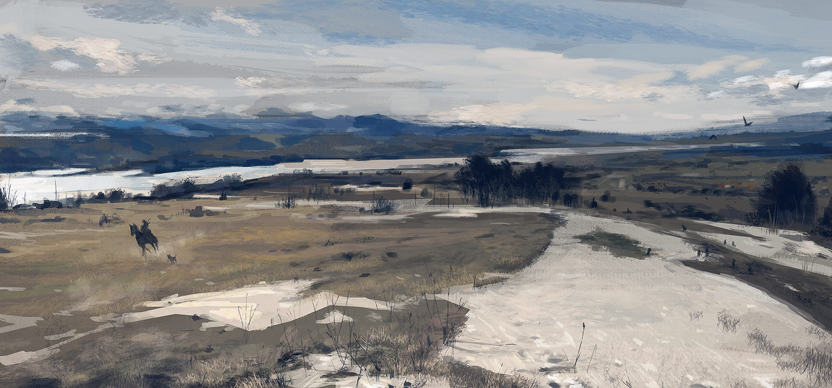
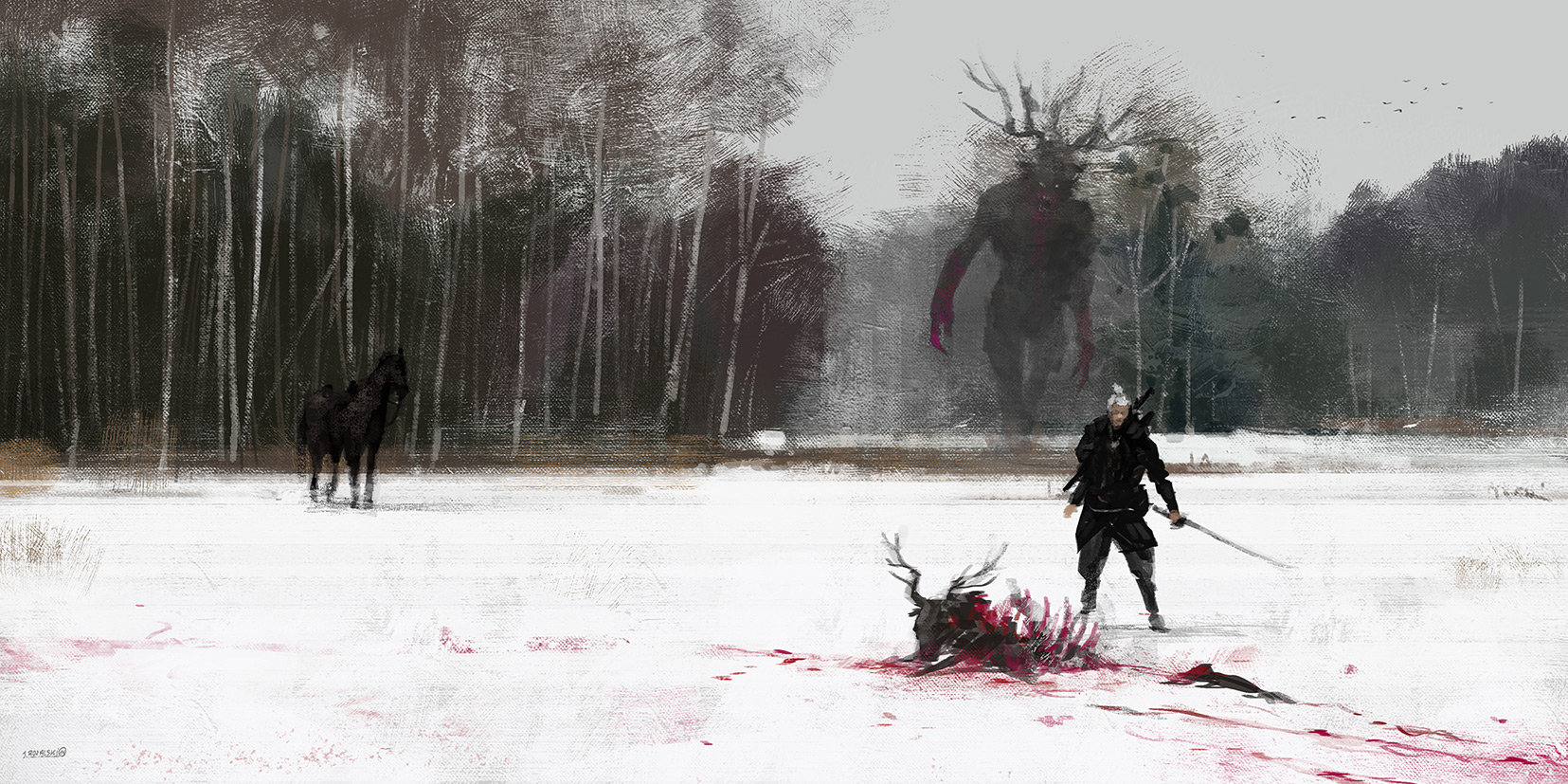
I expect CD Projekt RED choose an art-style that best suits the pace of The Witcher 3. As an open-world game that is also meant to be immersive, the pace of the game will be determined in a big way by the player and how rapidly they want to complete quests and how often they want to wander off the beaten path and get sidetracked. I expect for this kind of game having a grim-dark art-style would suggest a level of imminent danger that makes the open-world less inviting to explore (unless, of course, you can get pounded into a pulp at any moment whenever you wander off the beaten path.)
that is true, though that depends on the game, and the language you use to communicate. in dark souls tone doesn't exactly do this, it does, but that's not really what it is about. design does allot to communicate to the player but not tone or art style exactly.
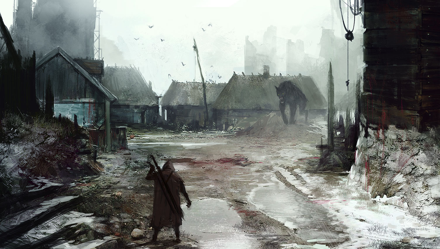
art style isn't something you really decide on, it is, but its also an accumulation of things, and most of it comes from design rather than an imperative, so you are right but only half right. for instance when a place like no mans land is dark and depressing it is both for narrative purposes and for communication, because no mans land is a place were nature has more of a grip, just like its name it is a place where "no man" is really in control of his environment, and so chaos is supreme thanks the the war. the tone of no mans land also now helps with game play, because it reflects the danger of the area, and you can expect to see many monsters thanks to the chaos, helping the player know that the area is dangerous. this is immersive and is related to game play.
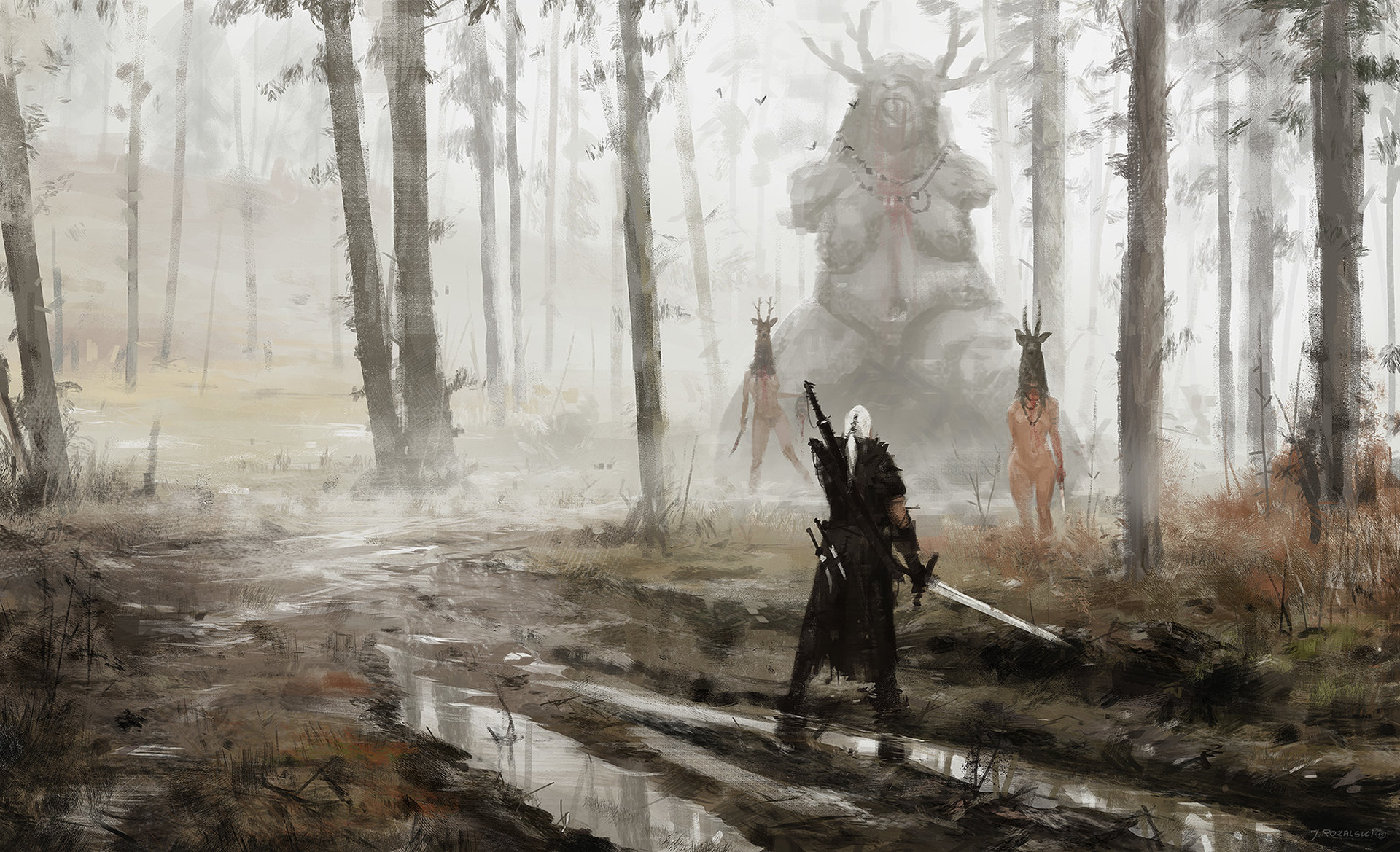
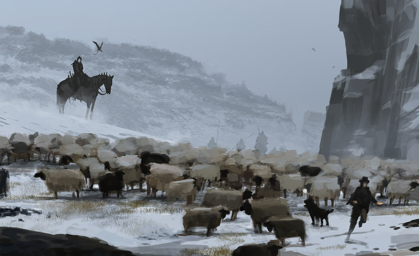
in regard to exploration too, something that looks dark in tone doesn't necessarily mean it will or wont discourage people from going there, it depends on how mechanics are used and how it is linked to the design. you can suggest through darkness that there is mystery, threat and hence adventure, (gloominess or darkness can be just as good or as interest as bright and colorful places can be the opposite) and that might interest the player, or not, it depends what the player is looking to do. darkness can be attractive and devs probably consider that.
so I make the point that art style or tone is not a target, we are speaking very broadly about tone and missing the point. the overall tone and art style is something comes out of the accumulation of element, something we use to describe our experience of them together, but they don't really so much exist as the hole, they do come together to make something but don't confuse the accumulation as the origin of that experience because the experience is the effect not the cause. there are so many ways of creating tone, we shouldn't talk as big and general as light or dark. art styles can be created from smaller parts (especially when they are of quality with a pattern of reasons to determine them), and can still be more or less subtle on the scale of an overall tone through lighting of filters, but more often there are intricacies that CDPR likely constructed, and this creates art style and tone. these intricate parts all do something effecting us on varying levels, greater or lesser. more people are effected by things that effect us physically like through mechanics and rules, and if you are observant it might be visuals, if like story it might be dialogue but when all of its effects come together that you get something that creates these elements we like to describe as a visual style or as a feeling we generally see.
I have loaded all this into a post, and you likely already know it. it didn't really need to be said. I agree with you it is linked difficulty I guess i just wanted to point out that there are allot of things that tone or the art style of the game is tied up with.
I also just want to point out that like the downgrade, we cant exactly make a complete assessment about tone or art style when we haven't played the game, or rather when we know so little about it and have never really experienced it in person. we don't really have enough information, but we can look at what we have, its really good discussion, just so long as we know that what we are talking is not the actual game, but our impressions of it from screens and game play at least till the games released. so when you look at tone in visuals we may miss allot because we see barley any different weather conditions or locations or other elements of the game or when talking about the games overall tone with what we have we don't experience the non visual elements that add to it, and so also miss allot of what could create the games atmosphere.


")