TW3 UI Aesthetics

+

Jupiter_on_Mars

Guest
The real question is:

Can we have a mouse+keyboard optimized UI on PC this time? If CDPR still take PC gaming any serious they shouldn't optimize the whole game for console controllers. At least it seems that there is a pattern based inventory now instead of lists which is a sign of hope... ;)

And "recommended potions"? WTF, seriously? I hope this is a joke...

The thread title «TW3 UI Aesthetics» was a rather deliberate choice to steer he discussion towards aesthetic considerations. The aspects you mention are undeniably important, so much that they deserve a thread of their own....
 
The real question is:

Can we have a mouse+keyboard optimized UI on PC this time? If CDPR still take PC gaming any serious they shouldn't optimize the whole game for console controllers. At least it seems that there is a pattern based inventory now instead of lists which is a sign of hope... ;)

And "recommended potions"? WTF, seriously? I hope this is a joke...

They said that each Platform (Console and PC) will have their own specific adjusted UI.
 
The thread title «TW3 UI Aesthetics» was a rather deliberate choice to steer he discussion towards aesthetic considerations. The aspects you mention are undeniably important, so much that they deserve a thread of their own....

You are certainly right but I also think that aestethics and functionality of a UI are not that easily to be kept apart. At least the layout of a UI should follow functionality to a big extend.

A "ring UI" as known from TW2 and also seen in TW3 for example is usually chosen to make UI handling as easy as possible with a controller. You probably wouldn't choose that pattern and layout if you made a PC game for mouse and keyboard. ;)

@Daywalker30
That sounds good. But I don't believe it until I see it. And another part of the problem is that even on PC many modern UIs are made for controllers. Many PC gamers nowadays come from consoles and want to play their games with a controller on PC as well. That means that we mouse and keyboard fans have to deal with more and more PC UIs made for an easy use with controllers. Or do you think that we will be able to choose between a controller UI and a mouse+keyboard UI on PC?
 
Last edited:
@Daywalker30
That sounds good. But I don't believe it until I see it. And another part of the problem is that even on PC many modern UIs are made for controllers. Many PC gamers nowadays come from consoles and want to play their games with a controller on PC as well. That means that we mouse and keyboard fans have to deal with more and more PC UIs made for an easy use with controllers. Or do you think that we will be able to choose between a controller UI and a mouse+keyboard UI on PC?

Well it was discussed a year ago or sth. and we don't know if we would be able to get both UI on the PC depending on the input device like controller or M+K.
I sure hope so that the M+K Interface is really adjusted to its input device and maybe get the console UI for the controller on PC as well, but as you said we'll have to wait and see.
 

Jupiter_on_Mars

Guest
Courtesy of @Kinley


Menu


Items

Swords:
Steel:


Silver:


Bolt:


Aside the font, the icons and symbols also look quite contemporary, which further amplifies the contradiction with the aged, epoch-specific feel of the rest of the UI.
 
Last edited:
I'm glad Marcin posted to say the UI is more or less place holder. Things I want from the UI:

- please, for the love of melitelee, make full use of M&K.

- legible font. This was a disaster in TW2 and took mods to fix it.

- make full use of the real estate for the PC version. I'm not playing on a HD TV.

- switching to various screens without having to back out again to the game.

- make sure the background, whatever it is, does not interfere with legibility.

- don't have artistic flourishes taking up space better used to display information.

- I'd rather see slots and info displayed strictly on the sides, corners or bottom of the game screen. Please don't clutter it up with UI elements. TW2 did this right.

- When in doubt, refer to old school RPGs like Deus Ex. This is when UIs were done best, before multi-platform games took a giant crap on the art of UI design.

Thanks again to Marcin for easing some worries here.
 
Last edited:
As mentioned before it does not look bad, specially the inside of the windows.
I still think the "windowborders" could look better with some TW1 art a like borders....

I also think the 3D Medallion should be in TW3 as the TW1 Meditation timer... these should
come back in some way ;)
 

Guest 2686910

Guest
Well, since the discussion is turning this way I'll chime in: if you're going to make a specific UI for mouse and keyboard for PC, let us choose between that and the consolish, pad-friendly one. Because I love me some Dualshock 4, and playing those third person games with a k+m combo just feels kinda awkward to me.
@down
That would actually be awesome.
 
Last edited by a moderator:
well maybe on PC we get the option to switch between a mouse + keyboard UI and a controller / console UI

Because PC Masterace can :D hahahah ;)
 
Guys I really doubt they are gonna make 2 separate UI's for pc and consoles,remember what skyrim's developers said? damn fucking right .
 
Well since we all got something to say.... I dig it man, I do I really like it. It looks good, now as a console player myself as far as TW2 goes the one thing that made navigation hard was the lack of toggle controller navigation it's self. I like to be able to move through the grids on each page or whatever with the toggle and go straight to it and not having to keep pushing my bumper to navigate quest items herbs crafts swords etc.. Dragon's Dogma lets you use your toggle to navigate stuff. I forget if it's left or right toggle but yeah you get the idea at least for console players. :)


Oh and what are is the chance of seeing that Geralt in his awesome stance change with the new armor and weapons we use.
I think it would be kool to see him wearing or not wearing what we select in that menu inventory screen as well. I doubt you need to add a toggle 3D panning view of Geralt but who knows I my self am fine if you just add the visual clothes and swords to Geralt as we change them in the inventory also if Geralt does look different when hes takes potions add that to his look to when we pause that would be sweet!!!
 
Last edited:
Yes it does not look bad, still if suffers from the "console minimalistic and functionality" demands
So it DO look kinda sterile... like the TW2 UI look was also sterile compared to the TW1 look

And nothing speaks against some artlike windowborders and a 3D medallion and the 3D
Meditation timer... (but sure this is my opinion for that)
 
I personally think The Witcher 2 Menus and Interface, were great, and this is similar, but I agree the colour and background need to imrpove a lot, but I´m more concerned about the HUD, I like that is almost the same as in The Witcher 2, that one was perfect...


And you even can turn off the notifications, but in the gameplay of The Witcher 3 they added some annoying labels, that are too much intrusive to the "scene", I hate intrusive HUDS, and more in a beautiful game like this one, and even if you are seeing the center on the screen, you see those labels at the left of the minimap, and the right of the potions, they are very annoying, those elements takes too much area of their corners, in The Wicther 2 you see the potion icon without labels, and the same with the minimap, I hope for a "the least things on screen better" HUD, or at least an option of customization. :D


Sorry but I didn´t find any The Wicther 3 gameplay screens. :(
 
Last edited:

Jupiter_on_Mars

Guest
Watching the 1080p swamp footage, I solidify my take on the UI. It needs an extreme makeover; Regret to say it has no redeeming qualities.

Information is scattered around the whole screen, displayed in the least handy places. There's no hierarchy, no focus.

Each tab has its own icon and description. Why?
Man, oh, man.

I personally think The Witcher 2 Menus and Interface, were great, and this is similar, but I agree the colour and background need to imrpove a lot, but I´m more concerned about the HUD, I like that is almost the same as in The Witcher 2, that one was perfect...


And you even can turn off the notifications, but in the gameplay of The Witcher 3 they added some annoying labels, that are too much intrusive to the "scene", I hate intrusive HUDS, and more in a beautiful game like this one, and even if you are seeing the center on the screen, you see those labels at the left of the minimap, and the right of the potions, they are very annoying, those elements takes too much area of their corners, in The Wicther 2 you see the potion icon without labels, and the same with the minimap, I hope for a "the least things on screen better" HUD, or at least an option of customization. :D


Sorry but I didn´t find any The Wicther 3 gameplay screens. :(

I agree.
There is simply too much space being wasted. It's distracting and counterproductive. HUD needs simplification. Outside of combat, and aside from the minimap for those who so swish, the HUD should be pretty much invisible.
 
Last edited:
Watching the 1080p swamp footage, I solidify my take on the UI. It needs an extreme makeover; Regret to say it has no redeeming qualities.

Information is scattered around the whole screen, displayed in the least handy places. There's no hierarchy, no focus.

Each tab has its own icon and description. Why?
Man, oh, man.


I agree.
There is simply too much space being wasted. It's distracting and counterproductive. HUD needs simplification. Outside of combat, and aside from the minimap for those who so swish, the HUD should be pretty much invisible.

Yes this game needs an "inmersion" in the game type HUD, the least, the better, Minimap only like that screen on The Witcher 2, and the medallion/life in combat. and even that can be remove by customization options, you see too much blood in the screen? RUN. :D
 

Jupiter_on_Mars

Guest
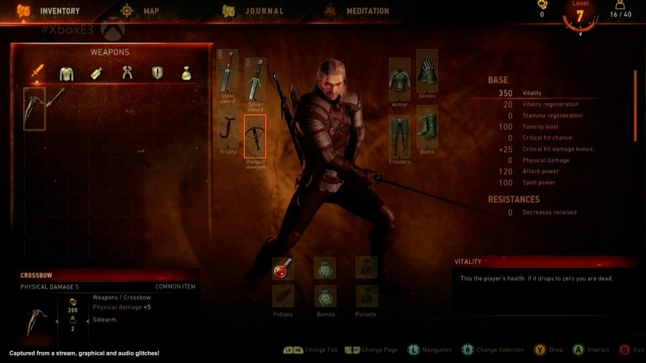
@Marcin Momot , I'd like to discuss this shot as it showcases some additional aesthetic problems the UI is exhibiting, knowing all too well this is WIP.


1. You've got no less than 10 different areas where info is displayed and scattered in. Couldn't some of them be made to conflate?

2. On the right side of the screen, under «Base», you find two columns. Why is text size different in them? Why isn't the gutter, the space between the two columns, proportional to the text size? That gutter is too wide for columns that are right and left justified.

4. Beneath you find an info box titled «Vitality» that explains what vitality is. Why is the explanation given more emphasis than the actual numbers, especially since player will have learned what vitality is five minutes into the game? Should he need a reminder, placing the mouse cursor atop «Vitality» could display an infotip. Alternatively, a glossary might do the trick. Either way, we'd get rid of such a redundant and cluttering piece of info.

5. On the left side, you find the weapons inventory grid and, beneath, respctive stats. This is awkward, as the most ´natural and comfortable eye motion would be akin to reading, from left to right, not downward. When the player is going through the inventory, stats are likely to be the most relevant info. So why pick the bottom left corner to display them, when that area ranks rather low in terms of visual hierarchy?

6. The composition is leaning towards symmetry, with Geralt's model occupying the central axis, and with one panel to his left and another to his right. If so, why is the bottom navigation «change tab...Change page...Navigation (etc.)» right justified instead of cantered? To further compound the inconsistency, top navigation «Inventory...Map. Journal» is left justified. This is extremely confusing.

7. Why isn't «Crossbow» vertically aligned with «Vitality»?

8. Why aren't armour and equipment slots vertically aligned? Why is there a mismatch between the two columns, like in «steel sword / trophy» and «silver sword / ranged weapon»?

9. Descriptions and Icons. Why use both? Either icons are self-explanatory and thus dispense with descriptions, or they're not, and need a makeover. Tooltips could be useful, so that we'd get rid of descriptions.
 
Last edited:
The act of providing the user with information when it is relevant is known as Contextual Content. It allows a minimal design to be achieved by only providing the user with relevant information to the current context (ie, if you're just walking around you might see a compass/mini-map but not what sign you currently have readied. But when you're in the context of combat, UI elements appear on screen that are based around the functionality of combat)

Ultimately, I just want to UI to take every opportunity to reduce the amount of thinking needed and the amount of physical action taken (mouse moving, clicks, etc.) in order to use the UI. Common functionality should be made immediately accessible and easy to perform. Even the smallest loss of optimization in a task that is repeated often in the game can have a huge, tangible negative impact of the enjoyment. This simply means that testing the game against respective gamers of that platform is needed (ie, for the console version, QA test it against console gamers; they are in touch with the workflow of the console. And then do the same with PC gamers. DO NOT put primary console gamers to task on a PC QA team, nor should you assume the an input method aside from the system's default is being used) Supporting more is fine, but don't assume it's the primary input method.
 
I hope we see the PC UI concept soon... so we can give some feedback for it....
since it seems we ve seen the console UI i hope PC gets a bit more TW1 like UI back.

But of course the UI shouldn t loose the functionality, still these UI pics just give out a
sterile and cold feeling in comparision with the TW1 UI
like it was with the TW2 UI i think its just a point of HOW MUCH art they ll put in ;)
 
Well, the problem with making games for all platforms is dumbing it down to consoles, both in terms of graphics and gameplay/controls. The Witcher 2 is a good example of that where the UI was definitely catered toward XBox. I'm sure there might have been features that they wanted but not possible because of console limitations.

As long as it is possible to mod UI and gameplay, I'm okay with them cutting time for PC features. But I think they should have made the game for PC first without console limitations in the first place. I guess it's just not financially feasible, but I hope the modding capabilities are there.
 
I like how W3 UI look. Just wanted to point that out. I also like Geralt's face, Yennefer hairs and lot of other things people are complaining about :). Of course everyone have right to have their own opinion. But this is mine.
 
Top Bottom