


You are using an out of date browser. It may not display this or other websites correctly.
You should upgrade or use an alternative browser.
You should upgrade or use an alternative browser.
- Status
- Not open for further replies.
I don't mind the colour; i would have to agree it isn't giving off that gritty vibe anymore though.
Having said that it's probably for the best, playing a brown game would remind me too much of gta4, that had almost no colour-bleh.
No mans land/ areas with war might be more like that?
Having said that it's probably for the best, playing a brown game would remind me too much of gta4, that had almost no colour-bleh.
No mans land/ areas with war might be more like that?
Last edited:
Exactly! I think those are with hairworks disabled indeed! Still looking amazing!Wow that fur, and that's with nvidia hairworks disabled.
These new screens are definitely the best they have shown thus far. Top notch.
Do you even know what cartoony means? Real life is full of color, it's not dark brown and gray like modern shooters would like you to believe.
This is a cartoon

This is a painting, a pastel to be specific

Does this look like a cartoon to you?
What's up with the new screens? Why so cartoony looking?
Do you even know what cartoony means? Real life is full of color, it's not dark brown and gray like modern shooters would like you to believe.
This is a cartoon
This is a painting, a pastel to be specific
Does this look like a cartoon to you?
Where... were you when the last 2 games came out? It's been their art direction ever since, the opposite of 'photorealistic'.What's up with the new screens? Why so cartoony looking?
I absolutely adore the art style of The Witcher 3, it really seems to return to the painterly ACT 1 style of TW1
Compare

to

Good to see that the devs are putting so much color and life in the game. The landscape reminds me of Oblivion,
Compare
to
Good to see that the devs are putting so much color and life in the game. The landscape reminds me of Oblivion,
So we are hating the "cartoony" comments. Why? there is cartoony textures, lighting and colors...... that's true. And Cormacolindor post is evidence, since he is arguing that "colors are good, like oblivion", are they?
The Cartoony look of some parts of the game, not the entire game are true. Saying the game is cartoony maybe isn't correct. Saying the game is photorealistic is more close to what it is and looks like. But i'm not a fanatic that only sees the good and deny any criticism. I shared a point of view with Reptile mod about some color grading and sharpening effect used in old shots and maybe new ones, this is what is happening, some colors looks more saturated, some people would like that more than dark and brown colors.
In my opinion, it's not just some colors but some lighting is different and textures in vegetation. This could be a lack of post process filter that make the game more sharp and dark like a Sweet FX effect, or some changes in lighting.
Anyway, the game looks mostly Outstanding, near photorealism in some places, not that much in others. Colors are too saturated and washed for my taste.
Last edited:
@SageFox
Again, just because it has colors does not mean it's cartoony. Is an oil painting a cartoon because it has lots of color in it? Cartoons have exagerrated shapes and colors, The Witcher 3 does not exaggerate. An few examples of cartoony art styles are Blizzard games, Team Fortress 2 and Dota 2, which have saturated colors, exagerrated shapes and tons of references to pop culture through mannerisms .voice acting and overall look. Neither art style is inherently superior to another (despite what the internet believes), what is important is that the art style complements and fits the game. The Witcher has almost a fairy tale feel to it, especially in the swamp part of the 35 minute video and I think the vibrant art style greatly complements this feel.
Again, just because it has colors does not mean it's cartoony. Is an oil painting a cartoon because it has lots of color in it? Cartoons have exagerrated shapes and colors, The Witcher 3 does not exaggerate. An few examples of cartoony art styles are Blizzard games, Team Fortress 2 and Dota 2, which have saturated colors, exagerrated shapes and tons of references to pop culture through mannerisms .voice acting and overall look. Neither art style is inherently superior to another (despite what the internet believes), what is important is that the art style complements and fits the game. The Witcher has almost a fairy tale feel to it, especially in the swamp part of the 35 minute video and I think the vibrant art style greatly complements this feel.
Dandelion in UltraHD View attachment 9753
Attachments
-
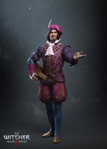 The_Witcher_3_Wild_Hunt_Dandelionsm-pc-games.jpg390.7 KB · Views: 83
Last edited:
Hot damn I love Dandelions "redesign". Very familiar but with a few little extra flourishes that give him extra elegance & grace, whilst his eyes/smile radiate this aura of mischief and cheekiness.
Does anybody know where I could get a hi-res version of this pic? Love this one so much https://fbcdn-sphotos-c-a.akamaihd...._=1432273331_07290d67e087a711b2a7a7f120b27cca
Does anybody know where I could get a hi-res version of this pic? Love this one so much https://fbcdn-sphotos-c-a.akamaihd...._=1432273331_07290d67e087a711b2a7a7f120b27cca
http://forums.cdprojektred.com/thre...tion-Part-II?p=1515852&viewfull=1#post1515852
Has this been posted already?

Thanks. That one is beyond awesome.
Any chance to get this one without the huge IGN logo? I want it as wallpaper and the logo ruins it

The picture you linked for got removed. Most likely by the mods; Because it was posted before embargo.
EDIT: nvm it got put back.
Last edited:
The picture you linked for got removed. Most likely by the mods; Because it was posted before embargo.
EDIT: nvm it got put back.
It was never removed in the first place, images just load slowly on that page because of all the gifs below that post. (And I would know, I'm a mod.
)- Status
- Not open for further replies.
Similar threads
- 7
- 6K