


Faction Board Skins: One step forward, two steps back?
Let's dive-in straight.
WHAT I LIKE: I like the painted middle row. It's as if a ribbon is tied around it. I also like the borders. For example, the golden mechanical ones for NG, the metallic ones for NR and SK, carved wood for ST and organic wood for MO.
WHAT I DON'T LIKE: I don't like the extra artwork added, specially to the left of the battlefield. I don't think it was necessarily, and it's making the screen look more filled than it should be. It's specially bad for NR where the castle looks mostly bland, for NG and SK (as you can see in the pictures). It looks fine for the ST though. The green leather looks real, and the squirrel-tail is a fine touch, although it seems a bit out of proportion and forced. The MO's one is almost perfect though, in my opinion. The problem is that it's impractical, and the hand-drawn look isn't helping either. I also don't like how instead of looking like a board, the battlefield looks like two separate trays joined together now. Big no-no.
WHAT I WANT: First of, the score ribbons (which show the total score) should be changed into the middle-row colours. Similarly, the coin and all highlights should be changed from red and blue to show the specific faction colours. Then, everything that has been added except the middle-row ribbon, the pattern over the individual row-score strip, and the borders should be removed. And finally, the separate trays should be made to look like part of the same board (battlefield)...even if the borders' artwork has to be sacrificed for it.
What do you guys think?
Attachments
-
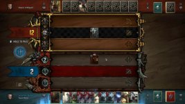 photo208131.jpg45.9 KB · Views: 23
 -
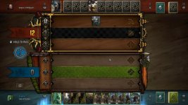 photo208141.jpg37.4 KB · Views: 32
 -
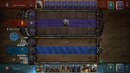 photo208151.jpg31.3 KB · Views: 25
