Improving the trinket screen
It's a simple suggestion to have a better overview and was probably already suggested.
Just add subtabs for the season-linked rewards, respectively one for the event-linked ones and add the date of the seasons and events.
Imagine this picture in good, I tried my best even if it is little.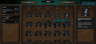
In this example:
I chose 'Borders' this opened the view for 'Season specific (1-5)' and 'Event specific'.
I opened 'Season specific (1-5)' and clicked on 'Season 2'.
Now it shall only show me the borders that have been distributed as a season 2 reward.
If I don't chose 'Season 2' it shall show me every border that is a reward for season 1-5 (including closed beta); Because I am already in the subtab 'Season specific (1-5)'.
This shall exist for titles and avatars as well.
The right side is sort of a deeper preview as it was before. We got the avatar and border coloured - even if you don't own it - and the information about the date/time span that border (in this case) was too achieve. I think it is sad that you cannot see all the borders in their entire beauty in the trinket screen; I like the most of the borders, thus I want to be able to do exactly that.
On top of that the genral rank borders could be shown in a subtab too. I like that you can see which trinkets are accessible in the game on demand, but I don't want to see a wall of greyed something if I am in my trinket menu, because I didn't achieve any of these borders - besides I am missing one at the moment, the monster border of the recent faction battle, it should be greyed and locked like all the other I did not earn.
An option to toggle between 'Show owned' and 'Show all', would be simple to add I suppose and would serve the structure duty.
Edit:
This is rather a suggestion than a general discussion, I accidentally posted it in the wrong sub-forum. Would be kind, if a mod would move this.
It's a simple suggestion to have a better overview and was probably already suggested.
Just add subtabs for the season-linked rewards, respectively one for the event-linked ones and add the date of the seasons and events.
Imagine this picture in good, I tried my best even if it is little.

In this example:
I chose 'Borders' this opened the view for 'Season specific (1-5)' and 'Event specific'.
I opened 'Season specific (1-5)' and clicked on 'Season 2'.
Now it shall only show me the borders that have been distributed as a season 2 reward.
If I don't chose 'Season 2' it shall show me every border that is a reward for season 1-5 (including closed beta); Because I am already in the subtab 'Season specific (1-5)'.
This shall exist for titles and avatars as well.
The right side is sort of a deeper preview as it was before. We got the avatar and border coloured - even if you don't own it - and the information about the date/time span that border (in this case) was too achieve. I think it is sad that you cannot see all the borders in their entire beauty in the trinket screen; I like the most of the borders, thus I want to be able to do exactly that.
On top of that the genral rank borders could be shown in a subtab too. I like that you can see which trinkets are accessible in the game on demand, but I don't want to see a wall of greyed something if I am in my trinket menu, because I didn't achieve any of these borders - besides I am missing one at the moment, the monster border of the recent faction battle, it should be greyed and locked like all the other I did not earn.
An option to toggle between 'Show owned' and 'Show all', would be simple to add I suppose and would serve the structure duty.
left: greyed and locked as it is right now, to clarify that you didn't achieve/don't own the trinket; Providing a clear overview.
right: This would be coloured, like it is if a player who reached the top 1000 in season 2 equiped it and you see it ingame (comparable to a preview)
right: This would be coloured, like it is if a player who reached the top 1000 in season 2 equiped it and you see it ingame (comparable to a preview)
Edit:
This is rather a suggestion than a general discussion, I accidentally posted it in the wrong sub-forum. Would be kind, if a mod would move this.
Last edited:
