Gwent Aesthetics: User Interface and Effects.

+

Gwent Aesthetics: User Interface and Effects.


  • Total voters
    64
Gwent Aesthetics: User Interface and Effects.

Ay, it's poll time!

I know there was rather widespread negative response to the new UI and effects, as introduced in the Midwinter Update: Some have called these 'cartoonish', 'childish', and even 'dumbed-down', to give only a few harsher examples. Others have suggested that the current appearance does not effectively reflect the darker, 'gritty' lore of The Witcher Series. Therefore, out of personal interest, I'm curious to see some numbers on how significant aesthetics and atmosphere are to Gwent-players. This poll is merely to assess in which direction opinions and priorities trend in our Forums' community. It is not a direct appeal to the developers to change anything.

To clarify a wee bit, by aesthetics, I'm not speaking of the artwork of the cards, which -- I believe most players broadly enjoy -- however, I refer to the game's framework: That is, the context in which the cards are presented, collected, and played. Examples being: The Deck Builder/Card Collection section, the loading, card-swap/redraw (Mulligan), and match-making screens, as well as the menus, taunt wheel, avatars, game board, shop, icons, and animated row effects, like weather, damaging, boosting, etc.

The basic questions here are: Do you feel the current aesthetics established by the UI and animations are consistent with the perceived content, atmosphere, or 'flavour' of The Witcher Card Game, as expressed in the cards, and the lore upon which they are based? And how important is this aesthetic continuity to your overall enjoyment of the game?

Moderator's note: If anyone would like to post comments on Gwent's appearance and atmosphere, please, feel free; however, please, remember to keep criticisms respectful of the RED designers' hard work, and try to give constructive, specific feedback, either way. Thank you.

Cheers.
 
Short answer is no. Long answer is as follows;

It really looks strange. It looks cheap, so to speak.

It's not like it makes the game truly unplayable but it's a a symptom of things I don't like. It's moving away from what Gwent was/is supposed to be. And aesthetics play a part in that.

To put it simply, Gwent looks cheap.
 
Snake_Foxhounder;n10134692 said:
To put it simply, Gwent looks cheap.
Ah, now there's another adjective I saw rather often in those recent responses. I'd like to delve a bit deeper, though, looking for more specific examples of what gives people this impression. In comparison with the previous appearances of Gwent, which particular aspects would you say look 'cheap' now, and what makes them seem so? What would make Gwent 'richer' for you?
 
- Most important thing first: The mulligan screen I'd like to see:
https://i.redd.it/bq2xki2sb8gy.jpg

- The cards being squarish on the board is another thing which really disturbs me.

- Furthermore I don't like many of the new animations. Esspecially the consume, scorch and buff animations look much worse than before. I think they should try to give the game a more "grown up" look.

edit:
And an option to switch off the buff/damage numbers would be nice.
 
Last edited:
Interesting ideas, BornBoring . Have you also submitted this feedback to Gwent Support?

As for the present discussion, again, I'd like to delve a bit deeper into terms like 'grown up'. What specific qualities would make Gwent more 'grown up', opposed to 'childish'? I know these may seem rather simplistic questions -- and I a fool to ask them -- but, in the interest of exploring the topic, I'd like to encourage those who've expressed their opinions to unfold their words, so we can better understand the concept of aesthetics.
 
Gwent used to look more mature, so to speak. Gritty and dark. Now it looks almost plastic-y. Like comparing a figure from a high-end company, like PlayArts to a cheap knockoff.

Effects like overdose used to have a big impact when played. You felt them taking effect. Now it's a more toned down, wash-over effect, with crap audio. Damage effects sound like a clap, instead of an impact.

Gwent looked and sounded like a game made by a AAA company. Now it looks/sounds like a game made by 5 guys in a garage.
 
  • Faster draw and swap animations are fine
  • Removing enemy's card selections (black sheep wall) was the right move
  • What was the point of making opponent card highlight brighter and more visible? It's too distracting and should have an option to be turned off.
  • I don't think The Witcher universe is THAT gritty but all these new pastel colors is not reflecting it either. Still black/dark grey half transparent background is the optimal.
  • Changing RnR, Skellige Storm, Consume etc. animations was the worst idea ever. They were awesome before but now they look like they are from a cheap amateur developer's rip-off. Why not keep it optional for players who have performance issues?
  • Same goes for card placement. I don't know what changed but before, cards were put on the board like they are solid rocks but now they are just hovering feathers. I mean they are "cards" after all and it makes sense them to be light as feathers but placing a 25 point Tibor shouldn't feel the same as a 1 point Medic.
  • Unnecessarily big coin and too much empty space vs not big enough cards on board. Scaling is all wrong.
  • Minor thing: Why do we still have Melee/Ranged/Siege signs on board?
  • Graveyard/Card Selection Screen have no difference at all. Should be seperate color sets and have different elements depending on the faction (like tombstone for NR, earth mound for MO, crypts for NG, ruins for SK. dunno.)
I can go on and on for hours but these are the first ones that I could think at this late hour. Not that CDPR cares about feedback nowadays but still, these must be said.:hatsoff:
 
altaybek;n10135132 said:
Not that CDPR cares about feedback nowadays but still, these must be said.
I've a different impression of the value they place upon feedback, even if they mayn't immediately act upon all of it. It's long been their policy to read and listen, but only rarely reply. Provided that we acknowledge the volume of comments they receive, and the enormous challenge of finding a compromise between the requests, suggestions, criticisms, and technical considerations which have arisen in the course of Gwent, and their developers' desire to express their creative, and innovative, impulses as well, the REDs face an intriguing balancing act. Nonetheless, they still welcome feedback

As such, I continue to encourage players to share their thoughts -- politely, of course -- taking care to identify what it is they like, or dislike, and why.
 
Not sure if it falls into aesthetics or not, but the "token" images also could be different. By tokens i mean the cards that appear when choosing from several different options if a card has more things it can do. For example, ointment or that bone talisman. It would be nice and also very practical that the pictures are different so we don't have to hover over the cards each time to see what each does.

And everything mentioned above:).
 
Riven-Twain;n10135252 said:
I've a different impression of the value they place upon feedback, even if they mayn't immediately act upon all of it. It's long been their policy to read and listen, but only rarely reply. Provided that we acknowledge the volume of comments they receive, and the enormous challenge of finding a compromise between the requests, suggestions, criticisms, and technical considerations which have arisen in the course of Gwent, and their developers' desire to express their creative, and innovative, impulses as well, the REDs face an intriguing balancing act. Nonetheless, they still welcome feedback

As such, I continue to encourage players to share their thoughts -- politely, of course -- taking care to identify what it is they like, or dislike, and why.

I'm well aware that they are one of the best when it comes to listening and pleasing their player base but this last patch is a big minus all by itself. Everyone played in PTR said what needs to change yet they didn't care for it and released a half-done patch. It's understandable, they are a huge company now and need to think quick and take risks sometimes for the sake of business but this risk was totally unnecessary. Patches come and go, people sooner or later adapt. We saw established games like Diablo 3, Dota, WoW etc. change their core drastically many times. Gwent is very fresh and beta and anything can change.

Some of the negative things will eventually change according to constructive feedback but Witcher/Gwent fans are rightfully fearing that CDPR will turn out like other greedy game companies. This is why I added "nowadays" in my criticism. CDPR's indifferent attitude before releasing this patch was the problem.

Whatever let's not de-rail the thread any further. It's been discussed many times
 
Last edited:
Short version: I like how the Gwent looks, but there is also some room for improvements.


And then the long version!

I really loved Witcher games and how the world looked in the games, but Gwent is different game, so I think it doesn't have to look exactly like Witcher. Even though it is a Witcher card game, but it's still a different game. I really loved those "cartoonish" scenes in Witcher games, so I don't see a problem with those in Gwent. Also Thronebreaker seems to be using this different art style, which is nice. I wasn't a big fan of the card style that was first introduced in Kill The Servers, but I fell in love with this current card (frame) style the moment I saw it.

I really like those "floating cards" when the card gets played on the board and the shadows that it makes, moonlight effect is very beautiful... Some buffing/debuffing effects looked strange when I first saw them, but after a while it doesn't look strange anymore. It was just new and different. Also one nice little detail was the black background in the shop, which was added behind the keg amount and stuff. Makes things easier to see, since now those numbers won't disappear into the light background.

Few things to improve would be a bit darker mulligan/graveyard screen, and I think that the cards you put into your deck in Deck Builder looks a bit too "bling bling", but neither of those issues is "game breaking" for me. Also the "Opponent has passed" thingy is a bit too dark, it could be slightly more transparent.
 
The UI of Gwent was never it's selling point. Let's be honest, even the old UI was pretty lackluster. The new UI took a step backwards in terms of aesthetics, but at least it took two big steps forward in terms of functionality. Because, for me, functionality is still more important than the look and feel, the new UI was overall a slight improvement. But it still has me worried that CDPR changed all this just to become compatible with the mobile platform. And in Gwent's current state, the trade-off is not worth it. At least make a prettier UI for PC/Console users. Even though I would like the UI to change, CDPR has more pressing matters to attend to first.
 
To give my 2 cents,

i used to love gwent because i love the witcher series. The witcher series is a deep, atmospheric and rather serious one. This atmosphere was translated perfectly to the initial gwent version. I felt the same thing as i was feeling when playing the witcher.

Ever since the patch it is gone. Everything has gotten faster and more flashy. If you'd reverse engineer the witcher games from what gwent is today you'd probably end up with something more akin to Darksiders or WoW.
 
Last edited:
First off, I completely agree with this

Sunsibar;n10135382 said:
I really loved Witcher games and how the world looked in the games, but Gwent is different game, so I think it doesn't have to look exactly like Witcher. Even though it is a Witcher card game, but it's still a different game. I really loved those "cartoonish" scenes in Witcher games, so I don't see a problem with those in Gwent.

and this

nemirni;n10135312 said:
Not sure if it falls into aesthetics or not, but the "token" images also could be different. By tokens i mean the cards that appear when choosing from several different options if a card has more things it can do. For example, ointment or that bone talisman. It would be nice and also very practical that the pictures are different so we don't have to hover over the cards each time to see what each does.

¤ In other words, I don't find the new look of the game too colourful/"childish"/flashy.

¤ I don't mind the glittery effect that premium cards have in the deck builder; it makes them easy to distinguish without being too eye-catching.

¤ The black background when viewing a card in deck builder is a lot better than the old transparent, blue one.
¤ No longer being able to tilt premiums with the mouse really takes away from the "aesthetically pleasing" factor(, but I guess this might be a bug rather than intended).

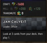
¤ A major improvement is this part of the card overview:
card_info.jpg
The colour and pattern that varies from faction to faction is great.

¤ The "boards" showing level, rank, avatar and resources are a nice touch.

¤ The mulligan/graveyard/card choosing screen is indeed a bit too bright, so it could use some darkening.

¤ The new boost/damage animations are better than the old ones even from a purely aesthetic viewpoint.
¤ Epidemic's old animation was better than the new one.
¤ The removal of the RNR fiery rockfall is a good change IMO; it took way too long when hitting all three rows.
¤ Moonlight animations are stunningly beautiful.
¤ Pit Trap visual is awesome.
¤ New Consume "bitemarks" animation is fun and fitting.
¤ (New) Aard, Igni and Yrden effects are brilliant.

¤ Being able to clearly see eligible targets when playing cards that need to be targeted is a big improvement both aesthetically and functionally.

¤ I really like the "wooden" look that's more prominent now than before.


That's all I can think of right now. This post is already long enough, anyway. :p
 
Last edited:
Riven-Twain;n10135062 said:
As for the present discussion, again, I'd like to delve a bit deeper into terms like 'grown up'. What specific qualities would make Gwent more 'grown up', opposed to 'childish'? I know these may seem rather simplistic questions -- and I a fool to ask them -- but, in the interest of exploring the topic, I'd like to encourage those who've expressed their opinions to unfold their words, so we can better understand the concept of aesthetics.

Generally the effects have to look somehow "realistic", impactful and the overall look shouldn't be too colorful and flashy (all these green lights etc annoy me).
For example the new consume animation somehow reminds me of eating a cookie. Because of that, I'd say it looks a little bit childish.
Two example for animations, which look less realistic are scorch and mahakam ale. I think mahakam ale is self explaining and the new scorch animation looks more like an exploding rotfiend than something being scorched. The old one felt so much better...
 
On the whole I find the new look to be too bright; there are a lot of primary and secondary colours, and when colours have to overlap they're not very distinct: see screenshot below.


On the deck creation screen I find these icons too small and indistinct (they all look alike)


If the faction and sort icons were the same size as the "mill spares" icon, that might bring more clarity to this screen.

The scroll bar in the deck creation screen either needs to be bigger or make the card description boxes smaller so that you can see your entire deck in one go without having to scroll. I've managed to remove cards from my deck whilst hunting about trying to grab that small scroll bar.

I'm not overly fond of the images used on the waiting screens (casual is Yennefer / ranked is that image that looks like a casino).

The mulligan window needs to be toned down, and distinct images need to be used for cards that have two or more different effects to choose from (clear skies/rally use the same image; it can be confusing, especially if you're on the hurry up and you have to stop and check you're hitting the right one).

Functionality wise, I think it's pretty spot on; I like the deck/card creation being rolled into one (at first I thought it was awful, but have changed my mind on this after much use - it's such a QoL update that it's not true), and I like the mulligan without having to scroll; that's fantastic.
 
Riven-Twain;n10135062 said:
Interesting ideas, BornBoring . Have you also submitted this feedback to Gwent Support?

As for the present discussion, again, I'd like to delve a bit deeper into terms like 'grown up'. What specific qualities would make Gwent more 'grown up', opposed to 'childish'? I know these may seem rather simplistic questions -- and I a fool to ask them -- but, in the interest of exploring the topic, I'd like to encourage those who've expressed their opinions to unfold their words, so we can better understand the concept of aesthetics.

I'll just add some examples about cartoony and childish:

OLD Consume animation : https://i.imgur.com/fhmSgAz.png
NEW Consume animation : https://i.imgur.com/sNrxXHL.png

The old one gave you a feeling that a battle was happening. The blood spatter and the dark colors match the witcher universe. The new animation is a cartoonish zig zag crunchy animation that often seen in cartoons.

There was also a dumbing down on other animations. While other card games like hearthstone step up their animations with every patch, Gwent is moving 2 steps backwards.

Scortch animation dumbing down :

OLD Scorch animation : https://www.youtube.com/watch?v=mFdur7mk7lY&t=14m50s
NEW Scorch animation : https://www.youtube.com/watch?v=BGXKo4la-dI&t=2m10s

These changes along many others, made gwent lose the witcher feeling it had.
 

Raunbjorn

Guest
Riven-Twain;n10135252 said:
I've a different impression of the value they place upon feedback, even if they mayn't immediately act upon all of it. It's long been their policy to read and listen, but only rarely reply. Provided that we acknowledge the volume of comments they receive, and the enormous challenge of finding a compromise between the requests, suggestions, criticisms, and technical considerations which have arisen in the course of Gwent, and their developers' desire to express their creative, and innovative, impulses as well, the REDs face an intriguing balancing act. Nonetheless, they still welcome feedback

As such, I continue to encourage players to share their thoughts -- politely, of course -- taking care to identify what it is they like, or dislike, and why.

But they won't change the cartoonish/hearthstone-like) look of the game. Based off Burza's "letter to the community" we now know that they will do this to attract more customers and he urges us who dislike this change, to see things from a different perspective and try to understand this.

Something I never will...
 
Top Bottom