The Witcher books (NO SPOILERS)

+
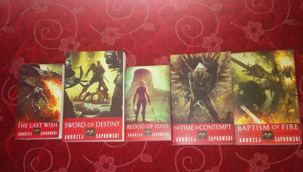
I've asked a guy from Reddit to take a pic of the UK Tower of Swallow he received from amazon today:


It seems they did the same mistake in format like for Sword of Destiny before... :(

There should be smaller standard format only. Last year only Sword of the Destiny was bigger. There was a lot of complains about it so UK publisher re-released it with correct fotmat this March. I don't understand then the format for Tower of Swallow...

I contacted Gollancz by email since they need to clarify this. But based on their contact details, it was unclear where to send possible questions or complaints about their books to. On purpose? So I defined my concern as a website related issue. Unfortunately, I did not receive a single response.

The easiest way of dealing with this, is apparently prodding Gollancz on Twitter. The bad news: we have to wait till March 2017 for the correct sized version :( .

Thank you for the information. But why they released the bigger version then? :(
 
I contacted Gollancz by email since they need to clarify this. But based on their contact details, it was unclear where to send possible questions or complaints about their books to. On purpose? So I defined my concern as a website related issue. Unfortunately, I did not receive a single response.

The easiest way of dealing with this, is apparently prodding Gollancz on Twitter. The bad news: we have to wait till March 2017 for the correct sized version :( .
Uh, what's the difference between trade paperback and mass market paperback? Is the latter a "cheap" version? By the way, according to that, other books had both versions as well. So that's not a mistake.
 
Yeah :( I've never seen any publisher doing this...releasing standard format then suddenly changing it...btw. the same thing happened also for US editions...

Maybe they're finally starting to appreciate their audience. The paper quality is higher, I guess. On the other hand the weight of the book also increases so I would go for the smaller form factor anyway :D.
 
@Sephira , @Gilthoniel that was supposed to be a genuine question, now I feel I'm being ignored :p

I opened this thread by chance and the first thing I saw was that picture that you posted. I saw those ridiculous covers with Roche and Letho, but I've never really expected to see a draug. Now I'm not sure what's worst. My question: are you aware of any other country/publisher doing something similar?

And now maybe a witty remark - I guess Draug and his fiery representation was their best association with Baptism of Fire, who cares what the book is about. Somebody should suggest that they choose this for the Lady of the Lake cover when they translate it :lol:
 
My question: are you aware of any other country/publisher doing something similar?

Unfortunately yes...there are new French edition of the Witcher with TW2 covers also:

(Lady of The Lake with Triss cover why not...she was in the book, right?)

Also older Polish release - well it was more like promo for The Witcher 2 game but still...no comment
 
Unfortunately yes...there are new French edition of the Witcher with TW2 covers also

Thank you. Some of the images are even the same for both the US and the FR versions but used on different books. Except for Baptism of Fire and the draug, of course (I know it has something to do with fire, I just can't remember what :D) It seems that the French and the Americans didn't even bother to make their own print screens :D

Lady of The Lake with Triss cover why not...she was in the book, right?
Well, you have a convincing argument there, but I still I think this would be a better solution


Thanks again
 
Thank you. Some of the images are even the same for both the US and the FR versions but used on different books. Except for Baptism of Fire and the draug, of course (I know it has something to do with fire, I just can't remember what :D) It seems that the French and the Americans didn't even bother to make their own print screens :D


Well, you have a convincing argument there, but I still I think this would be a better solution


Thanks again
Ah, thought your question was ironic. :lol:

Too bad because French covers used to be really nice. For example, old french cover for Blood of Elves:

 
Unfortunately yes...there are new French edition of the Witcher with TW2 covers also:

(Lady of The Lake with Triss cover why not...she was in the book, right?)

Also older Polish release - well it was more like promo for The Witcher 2 game but still...no comment

Lol these are so stupid. I cringe every time when I see them in a bookstore.

---------- Zaktualizowano 19:32 ----------

It's pretty ironic that the faraway China can do it million times better:


Guys I had a chance to download all illustrations from Denis Gordeev for the upcoming Russian Time of Contempt edition...so here are they! Enjoy! I recognised almost all scenes from the book - for some of them I had to think about for a while...

Thanks! Really good illustrations, my only issue would be the way Denis treats sorceresses. "At the sight of a naked Margarita Laux-Antille even marble statues of goddesses and nymphs would sob with jealousy" in his interpretation does not impress me :D
 
Top Bottom