


You are using an out of date browser. It may not display this or other websites correctly.
You should upgrade or use an alternative browser.
You should upgrade or use an alternative browser.
No Tachikomas though, 0/10I prefer mine.
Has cyberware.
Just saying.
For those who didn't notice.

I love these kinds of easter eggs. I guess this logo was in the works for a while.
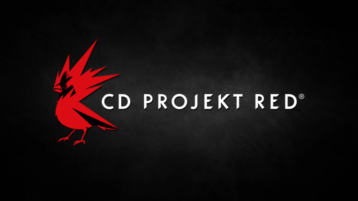
The new logo is a combination of energy and passion for game-making the studio is known for. This is how Adam Badowski, CD Projekt RED’s Head of Studio, sees the change:
We are rebels and rebels are free. Just like birds. The Northern Cardinal is what we see ourselves in the industry: intrepid, bold and confident; flying high and aiming even higher. The colour, cardinal RED, is something that connects it with another bird, a mythological creature close to our cultural roots and heritage--the Raróg, a small firebird believed to bring luck to people. RED stands for energy, the inner fire that drives us; it represents something very close to everyone here in the studio--the creativity and passion we harness from within ourselves to make the best RPGs in the world.
.
Well I like the idea, and Adam's description is great, more of this kind of thing please as it's too rare an occurrence- it's good to get an indication that mythology to you guys isn't just something you fill games with - but IMHO the application is quite poor. Its design is rather common, and looks more like a Puffin with a bad hair day than a Saker Falcon. Bird logos are ubiquitous on the 'net already, and evoke the rubbish that is twitter.
Not an original concept for a game company either:
View attachment 3399
Attachments
-
 Telecomsoft-firebird-software-fair-use-220px.png8.6 KB · Views: 104
looks more like a Puffin with a bad hair day
To me it looks like a bird with an exploding head, kind of like when hit by a bullet. Just look at all this high velocity blood sputter...
") I would call this new logo design "Blast from the Past".
I would call this new logo design "Blast from the Past". I apologize if I offended any bird lovers here.
@new&improved_vivaxardas @Kudos

..don't ask.
Just give me a Ciri reveal trailer and I'll stop, promise.
..don't ask.
Just give me a Ciri reveal trailer and I'll stop, promise.
Last edited:
@EmperorZorn: I'm impressed. You've made an image with no Ciri on it. :hatsoff:
@EmperorZorn: I'm impressed. You've made an image with no Ciri on it. :hatsoff:
I'm working on a Ciri one while I'm writing this here, so don't get excited...

@ [img]http://i.imgur.com/QDSYoeP.jpg?1?6018[/img] [/QUOTE] Wow [MENTION=2013369]emporerZorn ... thats a cracking piece of work ! The Raróg emblem , the Falcon, RED, and even the Witcher Medallion - recognising the companys signature game & bringing it into the future - thats a friggin logo
:cheers:
somebody hire that guy
![@ [img]http://i.imgur.com/QDSYoeP.jpg?1?6018[/img] [/QUOTE] Wow [MENTION=2013369]emporerZorn](/index.php?members/
[img]http://i.imgur.com/QDSYoeP.jpg?1?6018[/img]
[/QUOTE]
Wow [MENTION=2013369]emporerZorn.3651547/)
No Title
Hello,
I have been playing the Gwent beta for the last three days and I loved what you did with the logo at the opening scene. It went 3D with some crazy details added to the head and the wings. Brilliant.
Having said that, I may be a stickler here, but my eye keeps getting hooked on a detail every time I am opening the game. The far side of the bird's beak looks like there is a protrusion starting right from the side of it. I think maybe a little touch up like this might help?
What do you think?
Cheers!
Attachments
-
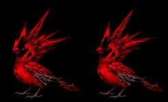 photo96660.jpg70.7 KB · Views: 3,249